Friday, 17 June 2016

The process of construction

Through the process of construction, I experimented and developed upon my new skills of using the image-editing software of Photoshop in order to create some album artwork for a band. We used Dyer's star theory to come up with our idea as we wanted to create a star as an ideology through the use of the colours blue and purple and create the ideology that music is mysterious and up for interpretation just as spells and magic are and this is why we chose an ambiguous and abstract image to represent this ideology of the band we created.


We started off by brainstorming our ideas and coming up with a concept and idea on paper. We first used a random word generator to create an initial idea and from this we picked the word 'spell' which from this we developed further ideas and words including spellbound, magic, enchantment, powers, alchemy, lightning, fantasy and fortune telling. We followed this up by creating some sketches from these words of what visual ideas we had and we used google images to help us with this creative process.


After we came up with an idea we chose a picture from the internet of a hand with a purple ball of energy in its hand and we wanted to incorporate the colour blue into our album artwork so we decided to layer the blue orb on top of the purple orb.


We did this by creating a new layer for the blue orb and we then followed this up by using the magnetism lasso tool to draw around the outline of the blue orb and decide on desired area we wanted to cut out and then once we had used the lasso tool to select an area we copied this and pasted it onto the other layer in which we had the image of the hand with the purple orb.


We realised that the blue orb looks very fake and stood out from the original purple orb, therefore we decided to utilise the smudge tool to hide the sharp lines of the blue orb and mold together the two orbs of colour to create a crisper look and more professional appearance of the orbs. We did this by selecting the smudge tool and dragging the icon across the outline of the two orbs making them ultimately appear more abstract and ambiguous. Additionally, we also used the smudge tool to make the lines for the outline of the hand appear less harsh and defined and try and make it appear as though the hand was merging with the black background. We decided to do this to imitate the ideology of the band through the ideas of Dyer's star theory and create the impression that the thought behind the smudging of the hand was to represent the fact that they blend into the background and that what is important is the coloured orb which represents the soul of their music and take the focus and importance away from the hand which represented the band members. We developed this idea through the ideas of the star as an ideology through Dyer's star theory.


We then had to come up with an idea for the background. We went back to the brainstorm that we did on paper earlier and decided to use the idea of sparkles, stars and light and so we chose an image off google images of a black background with little coloured stars or sparkles of light. We then created a new layer with this image and in order to put this image behind the other image we had created previously we had to drag this layer underneath the other layer using the layer tools on the right hand side of the screen.


When manipulating the size of the images we had to bear in mind that an album artwork is only 12cm by 12cm and this includes around 300 pixels/inch. Therefore, we decided to create this template of a size before we did any of the stages mentioned above. Once we had created our images we took into account the rule of thirds and decided that because you are supposed to put the most important information or most striking image on the right hand side usually near the top that we put the text in the top left and then the hand with the orb in the bottom left as this would create the most impact for the audience.


When creating the text we used the text tool and we came up with the name 'Enchanted' for the title of the album from the brain storm that we did previously and we came up with the name 'The Horoscopes' for the band because this derived from the ideas of the stars and the darkness. After writing the text using the text tool we decided to change the font of the text into something more abstract and more understated and we chose to go with the colour blue to mirror the orb and also to stand out against the black and the colour blue also matched the star image of them being down to earth and chilled, therefore the symbolic convention behind the colour blue matches the star ideology of the band.


After this we decided to manipulate the spaces between the letters to make the text more legible and add to the ambiguous vibe that we gave the album artwork. We did this by selecting the text tool that looks like an A which then allowed us to change the space between the letters and we chose to make the spacing 75 as we believed that this would work harmoniously with the star ideology that the audience are distanced from the band and music through Dyer's paradox that the star is both present and absent. So the spacing of the letters of the album title mirror the fact that there is space between the band and the audience.


Overall, my product was constructed first through a brain storm of ideas from a random word generator search, then explored further using inspiration from google images and then I utilised the skills I had acquired from my Photoshop lessons in order to use the smudge tool, lasso tool and also the transform scale tool. I used a variety of tools and techniques from Photoshop in order to construct my product of an album artwork taking into account the ideas from Dyer's star theory.


Introduction to Photoshop

Photoshop is a way of photographically altering an image digitally. Photoshop is essentially an image-editing software manufactured by Adobe Systems Inc. Additionally, Photoshop is considered one of the leaders in the world of photo editing softwares and it allows users to manipulate, crop, resize, and correct color on digital photos making them appear fresh, crisp and professional.


The main concept behind the image-editing software is that it is actually a skill and not a program and it can take a long time to perfect the skill and become familiar with the array of tools available on the software. Additionally, no idea is even completely 100% original as all ideas come from what we see in the environment and surroundings around us and we take in the images we see on a daily basis and store the ones we like and use them when we need to come up with a visually creative idea. This was demonstrated in Derren Brown's experiment looking at the impact that visual advertising has on society. 


There are many tools involved in the image-editing software including the lasoo, move, select and edit tools. These tools essentially allow you to use the software effectively. The lasso tool involves being able to either connect lines using the magnetism tool or draw a circle around the desired area to select. I discovered that you have to have a really steady hand when using this tool and it is also important to remember to double click when you have finished drawing around the desired area in order to select it. Additionally, the select tool looks like an arrow and this tool allows you to select or highlight the desired area. The move tool allows you select a particular image and move it to a different location. I also discovered that when you want to change the size of an image then you go into edit then click transform and then scale and a top tip for doing this is that in order to keep the image in the same proportions you should hold down the shift button to do this.


Photoshop also utilities something called layers which enable you to place image on top of or behind other images. It is important to make sure that you are on the right layer before making any changes. Photoshop layers are essentially like sheets of stacked acetate as you can see through transparent areas of a layer to the layers below which allows you to literally 'layer' the images on top of each other. You have to move a layer to position the content on the layer, like sliding a sheet of acetate in a stack. Additionally, you may also change the opacity of a layer to make content partially transparent which provides the vibes of an indie genre or can allow you to merge the photos together seamlessly.


I discovered that it is always a good idea to draft your ideas on paper before you start using Photoshop as this allows you to mind map your ideas and sketch out your thoughts before spending loads of time making it look precise on the computer. This is especially important in the industry as often people can dislike your ideas and so it is much easier to change them if you have drafted them out on paper rather than if you have spent hours or even days making the idea and image perfect on Photoshop. It also allows you to visually plan your ideas and make easy adaptations and minor changes to your design which can be very difficult to do on Photoshop since there is only 1 undo button and it can only take you back one step. 


There are many tips when using Photoshop including many do's and don'ts. One of these is to always hold down the shift key when manipulating the size of an image as this will ensure that you keep the dimensions and the scale the same and this will ultimately ensure that the picture is not contorted or manipulated in a negative way. In addition, another tip when using Photoshop is to plan things on paper first before starting to use the image-editing software as this will ensure that you practically and effectively plan out your ideas and this will ultimately save you time in the future. Another tip when using Photoshop is to try and not be overly creative or experimental with your ideas and just let the ideas flow to you and remember to follow the clear steps and stages to creating something using the program and let your creativity flow and don't force it. Finally, another tip when using Photoshop is to be careful and precise and mean every click and think carefully about what you are trying to do as it is very easy to make a mistake when using this software and due to the fact that there is only one undo button, it can be very difficult to go back to a few stages before you made a decision. 


Below is a video that I found on YouTube which provides an introduction to Photoshop for beginners and it goes through all of the stages and top tips that you need to get familiar with this image-editing software. However, it is important to note that Photoshop is a skill and not a program and therefore it takes a lot of time to practice and therefore perfect the techniques. 

Monday, 13 June 2016

Music Video Analysis

Madonna  - ‘Like a prayer’

I believe that the purpose of a music video is varied and involves many things including portraying a message to an audience, entertaining an audience and most of all promoting an artist/band. However, it could be argued that the sole purpose of a music video is to promote that particular track or song. From my point of view, a music video is a short film integrating a song and imagery, produced for promotional and artistic purposes. A music video forms part of a music campaign which aims to raise awareness of the artist and their music and additionally the bigger aim is to make money by the number of purchases and its position in the charts.


Madonna’s music video for the hit song ‘Like a Prayer’ is extremely controversial because it is trying to provoke a reaction from the audience as well as attempting to make them feel uncomfortable. Another reason why the video is so controversial is because it is scandalous, it is outside-the box and it is portraying a different ideology for the artist. The fact that this video is so controversial has meant that it has had a massive impact on society. 


The video is controversial because it involves disrespectful and offensive use of religious imagery and symbols, provocative dancing and clothing in a church, inequality and racism as well as displaying rape/sexual assault. This controversial content has had a massive impact on society as it covers very sensitive topics and it has also enraged many religious organisations as well as offending some cultures and ethnicities.


Madonna is a well known music artist and is considered to be a star according to Dyer’s star theory. Madonna is viewed as a star due to the fact that she fits the common values of stardom including rebellion, sexual magnetism, originality and of course a disregard for social values which led to her extremely controversial music video.


The term ‘star’ refers to the semi-mythological set of meanings constructed around music performers in order to sell the performer to a large and loyal audience and therefore due to the fact that Madonna has a massive fan base she is considered to be a star.


According to Dyer’s star theory, Madonna is seen as a star in terms of her ideology and the fact that she is viewed as a global cultural icon because of the influence and iconic nature of her recordings, attitude, clothing and lifestyle. Madonna’s ideology is that she is seen to represent women and she is sometimes referred to as the ‘Queen of Pop’ which shows how her ideology has worked harmoniously with that of her target audience and therefore has allowed her to gain a larger audience.


Negus’ theory of organic vs synthetic would clearly state that Madonna is synthetic due to the fact that her image has been constructed by the record company, making her appealing for audiences. In terms of the music video, Madonna can be viewed as synthetic due to the fact that she is seen throughout the music video, the main focus of the music video is on her and she plays a major role in the video as well as the fact that she is seen to be wearing a provocative dress and she is dancing provocatively which reiterates the fact that her image synthetic. Additionally, the use of the artificial and bright lighting on her face through the technical convention of lighting displays Madonna as a synthetic artist as this lighting is connoting the she is artificial and fake which reinforces a synthetic image.

The technical conventions used in the controversial music video involved the use of the close up camera angles which helped to build recognition for the artist as well as building up the star image. The connotation behind the use of the close up camera angles is that the focus is on Madonna and that she is the most important person in the music video and it also allows the target audience to see her face and see her dressed up appearance which adds to the star image suggested by Dyer as well as the synthetic nature of the artist suggested by Negus.


Additionally, the use of the mid shots and long shots of the camera allowed the audience to see Madonna’s body language and costume which included the use of the provocative dress and dancing which connoted that Madonna insinuates inappropriate sexual behaviour especially due to the fact that this body language and costume is completely juxtaposed gains the use of the location of the church.


The use of the technical convention of the artificial lighting provided Madonna with a glow of perfection and the use of the bright lighting used connoted that she was holy and further represented her as being the ‘Virgin Mary’ which provided intertextuality to ‘Like a Virgin’. The bright lighting used on Madonna contrasted against the use of the dark lighting used for the black characters which created an offensive connotation that black people are inferior and weaker due to the connotations behind the different lighting used.


In addition, the technical convention behind the editing of the music video allowed the images to be matched with the pace of the song which emphasised the tempo and the emotion of the music and adding onto this the fact that it was cut in sync with the beat of the rhythm connoted that Madonna was perfect and this added to the holiness created by the lighting.


On the other hand, the symbolic conventions used in the music video are highly specific to the genre of the artist and they embody the ideology of the artist as well as create meanings for the target audience. The use of the immaculate hair and makeup for Madonna connoted that she is perfect and adds to the paradox used in Dyer’s star theory saying that she is extraordinary which makes her more attractive for the target audience.


Additionally, the use of the props in the music video provided contacting connotations. The use of the red rose handed to Madonna by Jesus connoted that she is romantic and in love. However, the thorns on the rose also connoted that she is dangerous and unpredictable which works harmoniously with the controversial nature of the music video. The use of the prop of the knife which Madonna cuts herself on connotes that she is vulnerable in one respect but again dangerous and unpredictable in anther respect.


Generally, the locations used in a music video establish the domain of an artist and are suggestive of where they belong in addition to being familiar to the target audience and usually enable them to identify with the artist. However, the location used in this controversial music video is a church and the the ideology and behaviour of Madonna is not typical for a church nor relatable for her target audience. The use of the church represents Madonna as pure, holy and respectful, however her behaviour, body language and use of costume juxtapose this stereotypical idea of the annotations behind the use of the church. Instead, she is represented as being disrespectful because she is dancing provocatively in front of burning crosses and she is also seen to be kissing Jesus and there is the implication that she has sex with Jesus in the church which is strongly contrasted against the usual view of the connotation behind the location of a church and usual conduct and behaviour of people when in church.
 

The use of the symbolic convention of colour usually represents the mood of the artist. Madonna is seen to be wearing a red dresses and the connotations behind the colour red are romantic, passionate and also sexual and provocative which works harmoniously with the star image created in the controversial music video. Additionally, the use of the black and white provides connotations of a classic artist and the colours black and white are also viewed as being flattering for solo artists, especially in the case of females whose looks are generally perceived as being integral for their success which is true in Madonna’s case.
 

There are a significant amount of semiotics used in the music video which add to the controversy created. The use of the semiotic of the burning cross is seen as being extremely offensive in Christianity as it is viewed as a sign of a death threat for the blacks given by the Klu Klux Klan. This provided serious religious issues and racial issues which added to the controversy of the music video.

In addition, the use of the semiotic of the stigmata which is a Christian tradition of marking your own body to mirror those which were left on Christ’s body by the crucifixion. This is seen when Madonna cuts her hands on the knife and this semiotic is seen as being highly offensive towards the Christian church because it is suggesting that Madonna is holy and the use of the stigmata in the music video could be seen as mocking the Christian tradition which adds to the controversy of the music video.

An example of the use of intertextuality in the music video is the use of bright lighting on Madonna’s face which represents her as holy and the connotation behind this is that it is presenting Madonna as The Virgin Mary and this provides intertextuality to ‘Like a Virgin’, anther one of Madonna’s hit songs.

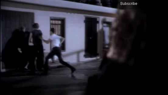
Additionally, the use of the inequality and racism within the authority in terms of the police and the legal system also makes the music video extremely controversial. An example of this is when the black man tries to save the woman after she is raped/sexually assaulted by a group of white men, however the black man ends up being arrested which highlights the injustice between the ethnicities and the issues with racism which again makes the music video even more controversial due to the fact that it is covering sensitive issues such as inequality and racism. It highlights stigma and perceived social and legal injustice.
 

The music video is also considered to be controversial because it covers taboo topics and it ignited the much alleged but little discussed exploitation by certain unscrupulous Catholic priests and their abuse of children under their care or control.

Overall, Madonna’s music video for ‘Like a Prayer’ has been viewed to be the most controversial music video of all time due to the fact that it displays the issues of racism, the disrespectful burning of religious imagery and also the provocative and raunchy costumes and dancing used in the video. It can be argued that Madonna’s video is viewed as controversial because it attempts and succeeds to provoke a reaction and make the audience feel uncomfortable as well as the fact that it goes against the norm, is highly scandalous, goes outside-the-box and finally it portrays a different ideology of the star.


Thursday, 9 June 2016

Looking at Album Artwork

I have been looking at album artwork and thinking about what contributes to good album artwork. I discovered that album artwork should construct the image of the artist/band as explained by Dyer’s star theory, convey the ideology of the artist/band, represent the genre of the music, attract the target audience, give an idea as to whether the artist is organic or synthetic as explained by Negus’ theory and finally that it stands out from the rest of the album artworks on the shelf.

marlowe – ‘it’s turning me on’ – debut EP

Do you think this album belongs to a band or artist, and why?
Through the use of the symbolic conventions used I would assume that it an artist due to the fact that the album artwork only features one person and it is a very simplistic image.

Is this band/artist being represented as synthetic or organic?
From Negus’ organic or synthetic theory I would say that this album artwork is definitely organic due to the fact that it appears marled, vintage and worn out.

What genre do you think this album is and why?
I would assume that the genre is indie because it appears alternative and ambiguous which fits well with the symbolic conventions associated with this genre of music.

What do you like/dislike about the artwork? Why?
I really like this album artwork because it is simplistic, artistic and alternative as well as being original and slightly ambiguous.

What questions would you ask the band/artist?
I would ask the designer the following questions about the choices behind their album artwork including Why the colour red? Who is the girl?  Inspiration behind the design? Why dark red? Why the classic old fashioned vibe, warn photo/ faded photo

marlowe – ‘darksparklecorner’ – debut album

Do you think this album belongs to a band or artist, and why?
I think that this album artwork represents a band due to the fact that it doesn’t single anyone out and it is clearly not one of the band members or the artist featured in the album artwork and additionally there is no focus making it appear that it is for a band not an artist.

Is this band/artist being represented as synthetic or organic?
I would say that they would be described as organic from Negus’ organic or synthetic theory because of the use of the simplistic design, the use of muted colours, the fact that it appears candid, unprofessional and washed out. Through the use of the symbolic conventions it makes me think that this band would be organic.

What genre do you think this album is and why?
I would say that the genre is indie/rock because the album artwork shows someone who is scared and this provides a creepy vibe which through the symbolic conventions used creates the sense that it is music of the indie/rock genre.

What do you like/dislike about the artwork? Why?
To be honest, I don’t really like this album artwork  because in my opinion it is not very aesthetically pleasing and appears to be quite disturbing and portraying a nightmare although it is very ambiguous and it isn’t clear as to what genre the music is.

What questions would you ask the band/artist?
I would ask the band the following questions: Who is the kid? What is the story of the boy? Is there a link to the songs? Or is a random photo? Why chose an over exposed picture? No space in album title, why? Were you not worried about the genre being to hidden? Not concerned audience might be turned off from creepy unsettling picture?

marlowe – ‘a day in july’

Do you think this album belongs to a band or artist, and why?
I think that this album artwork belongs to a band due to the fact that the album artwork features the use of children who are sitting together and this could be representative or symbolic of the members of the band.

What genre do you think this album is and why?
In my opinion, the genre of the music appears to be indie/folk and I got this impression through the use of the symbolic conventions used in the album artwork such as the use of the muted colours and the use of the children.

Is this band/artist being represented as synthetic or organic?
From my point of view taking into account Negus’ theory I would say that the band is organic because they have used nature, an aesthetically pleasing landscape, the worn out/vintage appearance as well as the muted colours.

What do you like/dislike about the artwork? Why?
I like this album artwork as it is aesthetically pleasing and it appears calming and tranquil which matches my impressions of what genre the music would be. The album artwork also provides a chilled out vibe and this attracts me to it.

What questions would you ask the band/artist?
If I got the opportunity to ask the band/artist some questions I would ask the following questions: Red link across all three?  Why? Does the image/title of the album have a significance to the band? Significance of the character positioning?

marlowe – ‘deep breathe fake air’

Do you think this album belongs to a band or artist, and why?
In my opinion, this album artwork suggest that it is of an artist and not a band because the artwork only features one person and the symbolic conventions used also suggest that it is an artist.

What genre do you think this album is and why?
I would say that the genre is indie because the words coming out the mouth suggest that he is singing it and the artwork itself provides the idea that it is indie and alternative.

Is this band/artist being represented as synthetic or organic?
From Negus’ organic or synthetic theory I would say that this artist is being represented as organic through the symbolic conventions of using muted colours and the ambiguous and alternative image.

What do you like/dislike about the artwork? Why?
I really like this album artwork because from my point of view it is cool, original, unique and aesthetically pleasing. This is one of my favourite album artworks from the group that I have been looking out because I believe that the idea is creative and imaginative.

What questions would you ask the band/artist?
I would ask the artist or band the following questions: The significance of the use of letters and that come repeat? Is this change form the last two albums reflecting a change in direction for the band? Is there a link to your first album and is so why? Why no eyes? Use of arrows? No identify throughout, why?

Testcard – Lines – debut album

Do you think this album belongs to a band or artist, and why?
I get the impression from the album artwork that it is a band due to the fact that it is very ambiguous and nobody is shown on the cover in addition to the fact that in my opinion the lines could represent the collaboration of the band members.

What genre do you think this album is and why?
I am convinced that the genre is indie because the album artwork, through the use of the symbolic conventions, provides an ambiguous and simplistic vibe which coincides with the indie genre.

Is this band/artist being represented as synthetic or organic?
In my opinion, Negus’ organic or synthetic theory would say that  this album artwork represents the band as organic due to the fact that the album artwork appears vintage and marled which makes it appear down to earth and original.

What do you like/dislike about the artwork? Why?
I like this album artwork because it is really simplistic and I believe that it would draw in an audience. However, on the other hand the album artwork is also very ambiguous and so it doesn’t give any clues about the genre of the music.

What questions would you ask the band/artist?
If I had the opportunity I would ask the band/artist the following questions: Why only lines? How does this help represent your band? Why the lack of colour when you have used red so often?

ROJA – ‘promises I should have kept’

Do you think this album belongs to a band or artist, and why?
I believe that this album artwork belongs to a band due to the fact that nobody is shown on the album artwork and this makes it quite ambiguous.

What genre do you think this album is and why?
In my opinion, the genre of music for this album artwork is indie/folk because of the symbolic conventions of the background and location and the use of the horse.

Is this band/artist being represented as synthetic or organic?
I think that this band/artist is likely to be organic according to Negus’ theory of organic or synthetic because of the symbolic conventions of the muted colours and the marled affect.

What do you like/dislike about the artwork? Why?
To be honest, I don’t particularly like this album artwork because I find it quite unsettling, creepy and off-putting. Additionally, the album is also quite ambiguous and it is hard to decipher the ideology of the band from the album artwork.

What questions would you ask the band/artist?
I would ask the band the following questions: Why the Mexican imagery? Why suddenly have the band name stand out? Title of the album seems more personal, why? What is the relevance behind it?