Sunday, 5 June 2016

Wix Home Page First Design - Sia Website


I have been experimenting with the website Wix which allows you to create a website for any purpose. I have created a promotional website as part of a music campaign for the artist Sia. I have created a home page for the artist which includes pictures, access to downloads of her latest album, recent interviews and also information about upcoming performances. I created my website without looking at the official website for Sia. I will now be comparing an contrasting between the website I have created and her official website to find similarities and differences between the two.

Here is the link to the website I have created:
http://nancikelham.wix.com/nancitest

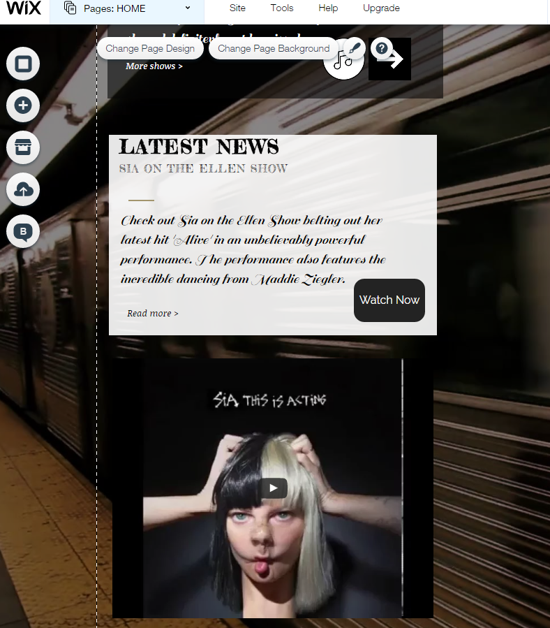
Below are some screenshots of the website I have created:


What does your website and original website have in common?


There are some obvious similarities between the website I have created and the official website. One of the similarities is that both website use and black and white colour scheme which makes the artist appear mysterious and adds to Sia’s iconic hidden look. Another similarity is that fact that both website use the image that is featured on the new album which shows how both websites are trying to promote Sia’s new album ‘This is Acting’. Additionally, another similarity is that both the website I have created and the official website use videos to promote her music and both website reference Sia’s performances on The Ellen Show and also the incredible dancing of Maddie Ziegler. This shows how even though I didn’t look at the official website before creating my own I was able to use some of the same elements from the official website in my own website using my knowledge of genre conventions, the ideology of the artist and also some of my own creative ideas which ended up matching those of the official website in some cases.


Do you have the same title font? Layout? Picture design?

I did not use the same font in my website as is used on the official website. The font I decided to use is much bolder and stronger which contrast with the font used on the official website which is much more abstract and dynamic. The connotations behind the arrows used in the official website symbolise how Sia and her music are on a journey in my opinion whereas the font I used on my website symbolises how strong Sia is and portrays her as a strong and well known artist. The layout is quite similar in terms of the information and videos are displayed vertically and the name of the artist is displayed prominently at the top of the page. Similarly, the use of the social media symbols is similar on both websites as well as the use of the different ways of downloading the songs are similar on both website. However, there is more emphasis on the music and there are ways of listening to the music on my website whereas in contrast the official website places more emphasis on videos displaying Sia’s music and interviews with Sia as well as a lot more information about upcoming tour dates. The pictures used in each of the website as similar. The same picture is used in both websites which is the picture used in the album artwork of Sia’s latest album. My website uses less pictures of Sia and more of related pictures making her appear more mysterious and hidden. However, the official website uses more images of Sia and her image is displayed more prominently on the page than on my website.


What is different between your website and the original website (be specific)? Why is this?

There are many differences between the two websites as well and this is predominantly to do with the fact that I created my website on my own using limited technology and information, whereas in contrast there would be many people working on Sia’s official website and this is why it looks more professional and there is a lot more information on the official website and the layout is a lot more advanced. One of the differences between the two website is the fact that on my website Sia’s name is placed in the top left corner and is placed in gold which connotes royalty and wealth. However, in contrast on the official website Sia’s name is placed in the middle of the website at the top and is in a less professional and important font and her name is also written in white with arrows which connotes that she is vulnerable and the arrows further connote that she is on a creative journey.


On my website Sia’s face does not appear until much later on in the website which adds to her mysterious image. However, on the official website the image of Sia’s face is one of the first thing you see as it is very prominent. This suggest that although Sia is known for her mysterious and hidden image, the record company has made her website so that the audience can see her face and recognise the artist before they see anything about the music as this way it allows the audience to recognise the artist and could suggest that they are trying to get the audience to buy the music solely based on the fact is it made by Sia, and not because it is good music. This ties in with Dyer’s star theory.


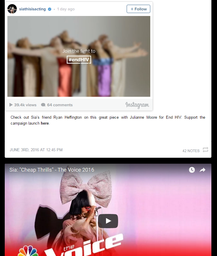
Another difference between the two website is that the official website uses a lot more visuals such as photos and videos and places less importance on informative text about the latest things that Sia has been doing. On the other hand, my website uses a lot less pictures and videos and contains a lot more detail and worded information. This is because the official website has been designed much better than my website as it is appealing to the target audience of young people and it recognises that people are unlikely to read reams of information and instead they have made the website a lo more interactive and visual than my website and this is because the website is for the fans and therefore it should be intriguing, exciting and enjoyable.


Additionally, my website only contains information about one upcoming concert which is contrasting the promotion of tonnes of upcoming concerts used on the official website. This demonstrates how the website is used to promote lot of upcoming events and concerts and so it is important to let the target audience and fans know about all of the upcoming concerts at a variety of venues as this means that the artist is a lot more available and it allows audiences to find a concert near them which makes them more likely to buy tickets for the concert. 


Is the genre obvious in both?

I believe that the genre is pretty clear in both of the website. The website that I created clearly shows that Sia is a pop singer however it also gives an indie vibe through the use of the background of a record player and the strip at the bottom of the bridge. The official website also makes the pop genre obvious however, it could be argued that the font used and the use of the black background could suggest the genre of rock or punk. Although, further down the page when there are videos of The Voice as well as brighter colours being used and funny pictures of the iconic Sia wig being incorporated into images does suggest that the genre is pop. Therefore the genre is obvious in both websites. 


Do you represent the same star image? Explain.

Richard Dyer’s star theory states that there are some common values of music stardom including youthfulness, rebellion, originality, creativity/ talent as well as success against the odds. The term ‘star’ refers to the semi-mythological set of meanings constructed around music performers in order to sell the performer to a large and loyal audience. I believe that both website represent the same star image but in different ways. In my website I placed more focus around the music and focused less upon Sia as a person as to coincide with her mysterious look created by the iconic wig. However, this strongly contrasted against the extensive use of pictures and videos of Sia’s face used on the official website as they have used visuals of Sia herself to try and create a star image of Sia as a person and so they are placing more importance on Sia as a person rather than her music, which juxtaposed what I used on my website. The official website has portrayed Sia as a commodity where she has been constructed by her record label to appeal to her target audience and this has been done through the use of images of her and videos of her which suggest how the record label has placed more emphasis upon Sia and less upon her music as they believe that this will ultimately attract and appeal to their target audience. However, on the other hand, on y website I have constructed Sia as an ideology and I have worked upon the idea of Sia placing more importance on her music and less importance on her appearance as this is what is suggested by her mysterious and hidden look as she always performs with a wig and never reveals her face to an audience. From my point of view she does this so that she can be present and ordinary as suggested by Dyer’s star theory. However, overall it can be argued that the two website represent different star images as my website constructs Sia as an ideology and the official website creates her as a commodity.


Saturday, 4 June 2016

Using Wix for the first time

When creating a website for the first time I used the software called Wix which allows you to design and create a website for a variety of different purposes. I started off by making a Wix account and then I had to select the genre of music in terms of a layout for the website. I then had to choose an artist to create a website for. The following steps involved choosing a background which i believed was appropriate for representing the star image of the artist I chose, adding information about upcoming concerts and recent interviews as well as adding in extra icons to represent the various social medias and ways of contacting the artist as well as listening to and downloading their music. Following on from this I decided to add on ways for the fans to listen to their music and ways to download and buy the songs and full album.


I believe that the use of the pre-made textboxes and templates made it much easier for me to grasp the concept of the software as well as aiding me in what information and tools I should place where. I found the side tools really useful such as the add tool which allowed me to add extra tools and ways to listen and download the music. I also found the layout that i chose and the design elements that I picked highly effective in not only conveying the typical symbolic conventions of the genre of the artist but it also work successfully as conveying their star image and their ideology.


When figuring out how to use this new software I struggled to grasp the concept of adding in the tools of the ways of listen to and downloading their music. This proved to be very difficult as I had to figure out how to add the individual tracks and add them to the playlist. I found this part the most difficult as it was quite technical and tricky. Additionally, I also struggled to make a decision in terms of the design and creative element of this task because I took my time to make sure I chose appropriate pictures as well as an effective colour scheme to match the star image of the artist.


Through completing this exercise I have gained a deeper knowledge into how to create a website and how to use the design tools to match genre conventions through symbolic conventions as well as portraying the star image of the artist. I also learnt how to add in different tools and textboxes with information about the artist and I learnt how to choose appropriate information, pictures, videos and an effective colour scheme to create the star image of the artist and also convey whether they are synthetic or organic and creative.


In order to make improvement from this process to the creation of my final website I will utilise more tools and make my website more varied, original and creative.

Overall, all of the skills that I have acquired through this exercise and getting to know how to use this new software will prove to be very useful when it comes to my final website design process. Additionally, I will take on board all the skills and tips that I have picked up from this process in order to create an effective and highly engaging and creative final website.

Friday, 3 June 2016

Music Campaign

Kings of Convenience

What is a music campaign?
A music campaign is a strategy used by music artists and bands which helps them to promote themselves through their album, website, music video and sometimes their concerts. Music Campaigns are often used as a marketing and advertising tool and their sole purpose is to make people aware of the music artist and create a demand for them which will therefore bring in the record company and the artist a lot of money.


What genre is the band/artist?
Kings of convenience are an indie folk-pop duo who create music within the indie, folk and pop genre. They are predominantly known for their delicate tunes, calming voices, and intricate and subtle guitar melodies.


Who do you think is the target audience and why?
I believe that their target audience would be teenagers and young adults as that is who I believe their music and they would mainly attract. I think that their individual style in terms of their look as a band in addition to their calming, tranquil and indie music would be attractive to a younger audience. However, their sound is also quite mature and so I would say that their target audience would probably be young adults and teenagers. 


Does the band/artist have a USP and if so what is it?
In addition to their quirky look and style as artists I believe that their unique selling point is probably the fact that the duo compose as well as sing their music which makes them write organic according to Keith Negus’ theory.  This means that an audience is more likely to be able to connect with them and their music due to the fact that they wrote it as well as sing it as it means that the music and the lyrics come from the heart and therefore this will have an impact on an audience. I believe that fact that the compose and as well as sing their own songs is Kings of Convenience’s unique selling point. 


How do the three products link together?
In my opinion, the three products all link together because they provide a mysterious image for the band and make them appear vintage, unknown and in a way a mystery. The album, website and music video all provide a peaceful, serene, simplistic vibe through the use of the muted colours, vintage looking images and the fact that in all three products the main focus is on the music rather than the members of the band. Additionally, the three products link together as they give the same impression of what the band is like and provide similar genre conventions in the sense that the band is indie, chilled, laid back and that they are down to earth and genuine which again provides an organic vibe.


What is similar across all three products?
The products all share the same font for the band’s name making their products appear synced and united. The font used is quite bold and clear yet understated and not too large and it doesn’t overshadow the album artwork or the rest of the content of the website.  In addition, the colour scheme in the three products is the same as they use muted colours which create a vintage vibe to the products which adds to the indie and folk genre. The three products are similar in a way that they are designed in a minimalistic and simplistic way which puts an emphasis on the music rather than the members of the band.


What is the ideology of the band/artist?
From my point of view, the ideology of the band is that the important thing is the music that they are creating and not what the members of the band are like in terms of appearance. Their dominant ideology is that they are promoting their music and their creation and not their appearance or themselves and individuals. This works harmoniously with the additionally ideology which is that they compose and sing their own material which makes them more genuine and relatable for an audience and it also allows the audience to connect with the lyrics in their songs as due to the fact that they are written by the members of the band it makes the lyrics more meaningful and I makes the members of the band appear genuine and real which adds to Negus’ theory of them being organic. 


What is Dyer’s star theory and how has your artist constructed this?
Richard Dyer’s star theory states that there are some common values of music stardom including youthfulness, originality, creativity and talent, and success against the odds. The term ‘star’ refers to the semi-mythological set of meanings constructed around music performers in order to sell the performer to a large and loyal audience. Dyer’s theory states that it helps if their image contains a USP which in the case of Kings of Convenience it is the fact that they both compose and sing their own songs.
Kings of Convenience have constructed Dyer’s idea of the star as an ideology. This is what the band represents and believe in, they could make this fit the target audience to gain a larger audience. In my opinion, the dominant ideology of Kings of convenience is that they place more importance and emphasis on their music rather than their look and appearance and this works harmoniously with their USP.
However, fundamentally the star image is incoherent; it is incomplete and open and this is because Dyer says that this is due to the fact that it is based upon two key paradoxes; paradox 1 – the star must be simultaneously ordinary and extraordinary for the consumer and paradox 2 is that the star must be simultaneously present and absent for the consumer. 


What is Keith Negus organic or synthetic theory and how does it apply?
Keith Negus’ organic or synthetic theory says that all products come under one of these two categories. Synthetic means that the band has been constructed by the music industry and they are under the control of the industry and this provides them with a fake, unrealistic and constructed image. Whereas in contrast organic means that the artist or band is individual, unique, relatable for an audience and they are more genuine and truthful. Keith Negus’ organic or synthetic theory applies to Kings of Convenience as they are organic due to the fact that they are individual, unique and they provide a genuine, relatable and truthful image for their audience and this is reflected in the three products of their music campaign.


What is different between the products? Why do you think this difference is there?
The difference between the three products of Kings of Convenience’s music campaign is the fact that the products use different images and pictures despite them conveying the same vibe for the audience. I believe that this difference is there in order to provide something new and fresh for an audience and it also provides variety and keeps the audience engaged and intrigued with their products. Additionally, the products use a different font as the title of the album is in a different font to the options to click on the homepage of their website. This is done in order to make the products different from each other which therefore attracts an audience as it mean that the band are open to experimenting and that they are creating new things and keeping up a fresh and current image to fit that of their target audience.


Do you believe this to be a successful campaign? If so why?
In my opinion, this is a successful campaign due to the fact that the main elements of all three products tie in together giving the band a uniformed look and giving them an image which fits with their ideology and the genre of music that they create. Additionally, I believe that the products of their music campaign will attract their target audience due to the fact that all three products convey a peaceful, tranquil, serene and mysterious vibe which will entice an audience making them want to buy the album therefore making the campaign successful. Overall, I believe that Kings of Convenience’s music campaign is successful as it fits in with Negus’ theory of them being organic, Dyer’s theory of them being youthful, original and creative as well as using their ideology to contrast a star image and finally I believe that their unique selling point also aids them in creating a successful music campaign.


Tuesday, 31 May 2016

Extra Research into Music Videos (OK Go)

I have been researching music videos and I have been trying to find incredible music videos which have used extremely creative and imaginative ideas and concepts and therefore have provided an alternative and out of the box music video.


 When conducting this research I discovered the band OK Go which have created an individual image which makes them stand out from other bands due to the fact that they have created highly original concepts fro music videos which step outside of the normal ideas that artists and bands usually come up with.


In my opinion, this band's music videos have provided them with an incredible unique selling point. The incredible thing about this bands music videos is that all of the things that happen in their music videos are completely real and genuine and nothing is created using CGI and this makes their music videos even more impressive, captivating and intriguing for an audience.


Their ideas have consisted of using the Japanese Olympic team to create an umbrella routine filmed from a birds eye view, the use of a aeroplane at zero gravity  making at appear as though  the members of the band were floating in the air and also the use of creating sound using everyday life instruments striking the real musical instruments from the sides of a car.

 ... Played Using A Car, Create New Music Video From OK Go (video

In my opinion, the music videos created by OK Go are some of the best music videos ever made simply because the concepts and ideas used as completely original, unique, authentic and innovative. Below are some of their music videos.

My Favourite Music


My Favourite Music from NanciKelham1999

This SlideShare describes my favourite music and includes details on my favourite genre of music, my favourite artists and bands as well as my opinions on their idealologies, albums and websites.


Below are some examples of music videos that I like:


Image result for pop music collage

WELCOME TO MY A2 BLOG WORK!!!


Food Blogger - Health, fitness or food blog for your business?