Monday, 4 July 2016

Music Video Idea 1

BIG YELLOW TAXI - Lennon and Maisy

For my first idea for a music video concept I have chosen the track “Big Yellow Taxi’ performed by Lennon and Maisy.


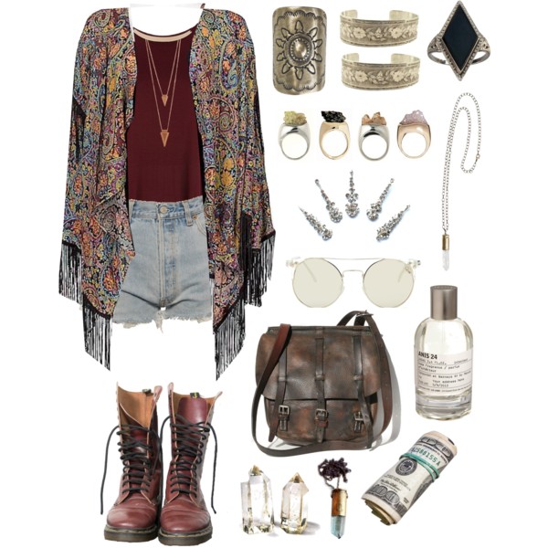
My vision for the duo is 2 teenage girls who look like regular people and their star images are fresh, bohemian and indie. The girls will have individual looks reflecting their own personalities. The values of stardom which I will incorporate to create their star image will be youthfulness, originality and creativity which will help to make them into organic rather than synthetic artists. I would want their image to appear casual and not overly sexualised. Their looks could be compared to Joni Mitchell who recorded the original or Taylor Swift with her earlier image which was more country. Their star image and sound would be similar to that of George Ezra (Budapest), Vanessa Carlton (A Thousand Miles) and Miley Cyrus (old image such as at the time of The Climb). 

Lennon and Maisy: 

Style Ideas for the duo:


I envision a performance element consisting of the two girls sitting on the bonnet of an old yellow car/back of a pick up truck playing the guitar and singing. The setting of this performance element would be a scrap yard symbolising the destruction that the world is experiencing as described in the song; that useful, good things are thrown away and disregarded/forgotten. The costumes for the two girls would be juxtaposing to reinforce their different personalities/styles. One girl would be in a flowery, floaty, festival style dress with flowers in her hair and the other girl would be in denim shorts, an old tee and a flowery kimono. The props used in the performance element would be the old car/pick up truck and an acoustic guitar played by one of the girls.


My vision for this music video involves a narrative which I believe complements the lyrics of the track. My idea for the narrative is that there would be a young girl and boy playing in the countryside (hide and seek, picnic, rolling down the hill, picking wild flowers etc.) and this would represent the innocence of childhood and how children create memories using their imagination to create stories in an environment that is special to them. However, this would be juxtaposed against the later narrative when the children are grown up and are dancing in a lyrical/contemporary style around a multi-storey car-park representing how the environment that they once played in as children has been destroyed and developed into something much more industrial, purposeful and practical rather than playful. The contrast between the countryside in which the children play and then the car-park will reflect the lyric “they paved paradise and put up a parking lot.’ I believe that this narrative would be impactful for the young millennial, environmentally conscious audience targeted by this band and I think that the narrative will resonate with the young audience and make them realise that a lot of the environments and places in the world which they were brought up in and created stories and memories in as children have now been developed and built upon and changed forever reflecting how their childhood dream worlds created by their imaginations have been replaced by the harsh realities of the adult world. 


There are a few stylistic elements which I intend on using in this music video. One of which is a lyrical/contemporary style dance routine between a teenage boy and girl which takes place in the car park. I also want to include some imagery which could be mirrored across the two parts of the narrative such as the passing of a object from the boy to the girl in both scenes. In the children’s scene it could be a flower he picks and in the adult one it could be car keys. This imagery would help to reinforce the message of the narrative. I also want to film one part of the narrative in colour and the other part in black and white to reinforce this contrast and also make it clear of the time change between the two scenes. 


My idea for the video fits in with the track since a lot of the lyrics match the narrative which I have created. I believe that the lyric “they paved paradise and put up a parking lot’ symbolises how the children viewed the countryside play area as a paradise and how this has been destroyed by the construction of a multi storey car park. Additionally, the lyric “don't it always seem to go that you don't know what you've got till it’s gone” reflects the urge to grow up that children experience without realising how precious their childhood is as well as a desire for progress which comes at the cost of a lost environment. Furthermore, the references to crop cultivation and the desire for organic produce are very reflective of the concerns that the young audience have. 


I believe that my concept for the video fits in nicely with the proposed star image of the duo. The narrative works well with the duo because the girls are teenagers and so the message described in the lyrics as well as through the narrative is very relevant and personal as well as relatable not only for the duo themselves but also for their target audience of young people. In addition, the values of their image involve youthfulness, creativity and originality which all fit with the proposed narrative, visuals and also the performance element. I believe that the message and moral of the narrative helps to give them an original star image as well as making them appear youthful through the use of the current topical issue of being environmental aware and conscious. 


In conclusion, my ideas for the duo, video and narrative all tie in together to create a current, organic and creative music video which will appeal to a youthful target audience and will also match the ideology of the duo as well as the track.


Sunday, 3 July 2016

Lip Sync

In order to prepare for the lip sync exercise we selected a song that everyone would be familiar with and know the lyrics well which is why we chose Megan Trainer’s song All About That Bass. Additionally, we also assigned roles to the people in the group including a person to play back the track, floor manager as well as camera man and performers. We alternated these roles to make sure that everyone had a chance to  learn from each of these roles. In the preparation for this exercise we also planned some background sets including a green screen with a sofa, a blue background with florescent lights and a black background with a fireplace to give the video a dynamic look and provide variety for the audience.


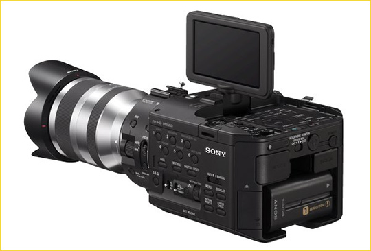
When we arrived at the studio we were reminded of the duties of the different roles we had been assigned as well as reminded of the different cameras that were available and how to use them. We used the Sony NX5, Sony  FS100 and the Canon 5D which are fantastic camera at obtaining very good quality shots and allow you to zoom in and get a very sharp focus to the shot. Additionally, we also utilised a dolly which allowed us to use tracking shots and manipulate the position of the camera. When in the studio we were also reminded of how to use the rule of thirds when filming and put the most important part of the image in the top left hand side as this is where the audience’s eye is drawn to.


When completing this exercise I learnt many things and gained a deeper understanding about how to film and edit a music video effectively and sync up the singing with the track. This meant that I learned that you have to use the numbers on the play back to match up the track with the singing on the individual clips to make sure that it is synched. Additionally, I also learned that it is really important that your performers know the words to the song really well and a great tip that I picked up when we were on set was that it is much easier for the performers to lip sync if they actually sing on set and then this sound is removed in the editing as this provides a much more natural and realistic movement of the mouth which is much clearer and more accurate to match the track to in the editing process.


I followed many steps when editing this music video in the editing suite. Firstly we watched through the clips to get a better idea of what clips we had and what they looked like. Next we looked for the play back numbers on the individual shots and layered them up with the backing track to make sure that they were all synched. Following on from this, after layering the individual shots without cutting them we then decided which shots we wanted to use and used quick shots and cut them in two using the laser tool. This allowed us to use quick shots and we could cut between the different shots, although we were advised not to go from shot 1 to shot 2 and then back to shot 1 as tis can be boring for an audience as it is predictable and they will remember what they have previously seen. After cutting the shots and selecting them we made sure that they matched up correctly with the track and then we put the clips in an order to produce the final product.


Through this process I learnt many things about how to edit a music video. Firstly, that it is crucial that the singing matches up with the track as this can make or break a music video and this tips works harmoniously with the fact that it is important to start the editing process by matching up the time on the clapper board with the time on the track as this will ensure that the singing is synched. Additionally, I also learnt that when editing a music video it is important to keep the audience engaged and intrigued and in order to do this you must not edit the video so that it is shot 1 then shot 2 and then back to shot 1 as in a shot reverse shot, but rather vary the shots and make the video diverse and varied within its content as this will appeal to an audience more. I also learned that you can speed up the editing process by matching up the time of the video content with the timings of the track this can make the actual editing a lot quicker as all you have to do is arrange the videos in order of what you prefer as you already know that they are synched.


Although my lip sync task was relatively successful, there were definitely some areas that I could have improved on in order to make my final music video more effective including making sure that the performers knew the lyrics to the song thoroughly and also that they had some chorography planned before hand therefore when filming my final music video I will make sure that during my pre production work I arrange for the performers to learn the lyrics and the choreography as this will ultimately make the final video appear more professional and slick. Additionally, I will also make sure that instead of just going straight in with cutting the shots at the start and creating a timeline to start of with I will instead match up each of the individual shots with the track and leave them at their full length and then cut them closer to the end of the process as this will ensure that it is all synched and also that the content is varied and flows smoothly.


Overall, I leant many things through the lip sync task including tips on how to film and edit a music video which will prove to be very useful next year and aid me in creating a professional look to my music video as well as making it effective and also appealing for an audience. Not only was the lip sync task highly enjoyable but it also provided me with a foundation of knowledge which is highly applicable to the production work I will be doing next year.


Below is the embeded video for the lip sync task:

Friday, 17 June 2016

Analysis of the final process and product

From the Photoshop workshops that we did I have gained a deeper understanding of how to use the image-editing software; Photoshop and this will enable me to apply my new knowledge and understanding of this software to my future Digi Pack. Overall, I was quite pleased with my final product of a piece of album artwork although of course there are definitely some improvements that I can make in the future.


I looked at many ideas and designs in order to get inspiration for my album artwork. I started off by doing a random word generated search to find a work to spark off lots of ideas and I chose the word spell which consequently led me to develop ideas about enchantment, magic, alchemy, spellbinding, fortune telling, potions and fantasy as well as many others. From this brainstorming of words I then got more ideas and inspiration from searching these words into google images and finding creative stimuli to help me get inspiration. I found images of purple and blue spells and orbs of light and colour as well as an image that I found particularly striking which was an image of hands on a purple ball of light. This image really inspired me and so I chose this image as a starting point for my design.


Additionally, I also went onto Adobe Colour wheel to get inspiration for colours to use and the colours that appeared for the magic theme were mainly blues and purples and so this further inspired the use of the purple orb.


Before I started experimenting with Photoshop I used paper to write up a mind map of ideas as well as sketching out a few creative and visual ideas. I discovered that drafting and sketching out my ideas on paper was really useful as you can very easily change and manipulate your ideas on paper and come up with a finalised idea and then move onto producing this on the computer software as this will ultimately save time as it allows you to only have to make 1 digitalised copy. Additionally, it is much easier to change your ideas on paper whereas in contrast there is only one undo button on Photoshop and therefore it is difficult to go back on your mistakes and change them.


My idea developed quite a bit from my initial idea to my finalised piece because my initial idea was to use the hand with the purple orb in it, however after receiving feedback from some of my classmates they said that it would be good to try and incorporate some blue into the purple orb. I agreed with this and in the end this formed part of the star image I created for the band as I created a mysterious and magical star image for the band and these colours really complimented each other and also worked harmoniously with the idea of mystery and magic. Following on from this, my inspiration from the adobe colour wheel experimentation worked with this also as the colours that were suggested for the word ‘spell’ were mainly blues and purples and so this aided me in developing my idea further which ultimately helped to make my final construction more successfully.


I created the album artwork for a band of the indie and alternative genre because I believe that the album artwork that I created provided a diverse, original and a creative expression feel to it. I think that the genre is very clear in my album artwork as I have used many conventions of the indie genre such as the use of the calm and funky colours of the blues and purples which fits in well with this genre in addition to the use of the ambiguous artwork that doesn’t display any of the band members which makes them appear mysterious which works effectively in portraying the genre of indie. Additionally, the use of the magic, fantasy and enchanted theme works well with the genre and therefore the album artwork supports the genre of the music in my opinion.


The album artwork that I designed is for a band, although I am not 100% sure whether this is clear to the audience. I decided to use quite an ambiguous and abstract image for the album artwork as I though that this would tie in nicely with the star image and their ideology which is that the music is more important than their appearance and I wanted to also create quite a mysterious look for the band to fit with the indie genre. However, it could be unclear to an audience as they could interpret the fact that there is only one hand as the fact that it is a solo artist. However, saying that I believe that through the use of the name of the band being The Horoscopes I think that this would provide the indication that it is a band and not a solo artist due to the use of the plural.


From my point of view, the target audience for the album artwork I have created would probably be teenagers and youths because I think that this style of album artwork and the ambiguous image and the bright colours used would attract a young audience. Additionally, because the symbolic conventions I used are typical of an indie band then I believe that because most indie bands target a younger audience then my precast would probably follow this trend.


Through applying Negus’ theory of organic or synthetic I would say that the band I have created are organic due to the fact that they are not featured on the album artwork and the image used is very ambiguous as well as the fact that the aim artwork suggests that they are chilled and down to earth which is connoted through the use of the blues and the purples as well as the fact that the image appears quite natural, original and their image appears truthful which makes me think that they would be organic according to Negus’ theory.


Overall, I really like the album artwork that I have designed as I believe that it looks original and unique and I believe that the star image and the ideology they represent it supported though the artwork and I like the ambiguity and abstract nature of the artwork. However, on the other hand I am not a massive fan of the font that I used for the album title and the band name as I believe that it is quite cliche and in addition I also believe that the font for the name of the band is too large and should be considerably smaller than the name of the album. But overall that I believe that my album artwork was successful as conveying the star image and ideology, the genre of their music as well as their organic image. Although I could have improved through thinking and planning the font and size of the text in more detail as well as possibly improving the quality of the image through more careful application for he techies and use of the various tools to create a more professional and more striking image.


In conclusion, I have definitely gained a deeper understanding of how the image-editing software; Photoshop works and how it can help you to create a professional and striking image as well as how the techniques and tips that I learned in my Photoshop workshop which will aid me hen creating my final Digi Pack. From exploring the skills and techniques of Photoshop I learned how to use the smudge, select, move and lasso tools a well as how to change the shape/size of an image and how to layer images and manipulate colours. All of these skills that I have acquired through this exploration will be very useful in the future and I will be able to apply them to my final Digi Pack as part of my A2 Coursework.