Tuesday, 12 July 2016
Music Industry Research Film
Above is a video that I made and edited which details my research into the music industry. I looked specifically at Beyonce and I looked into her star image, her target audience, her unique selling point and her synthetic image.
Saturday, 9 July 2016
Developing ideas for digipaks and homepages for Idea 3
I have been thinking about different visual themes that I could use to link my music video, digipak and website homepage together to produce a cohesive campaign. I want to make sure that the website and album artwork match the star image of the artist as well as working well with the interpretation of the track and the meaning behind the lyrics.

+Made+by+vermihendrix.jpg)

I have been looking at KT Tunstall's original album artwork for this track as well as her website to get some inspiration and see what the original is like and how I can incorporate elements of the actual artist's style and ideas into my own.
I like the original album artwork because it is simplistic and very clear to the target audience. However, I don't think that it is a very good representation of the artist's star image or of the genre of the music. I like the fact that it appears to be worn out and also I like the fact that it looks like the drawings could have been the artists own giving it a more personal and down to earth touch.

I was really surprised when I looked at KT Tunstall's website homepage because in my opinion the use of the bright colours and the image used completely juxtaposes the star image that was created in the music video making the products not work harmoniously. I don't think that the bright colours and geometric print fit with the look of the artist nor do they provide a cohesive campaign. I think that when creating my own website homepage for my artist I will use a much more discrete and mysterious colour scheme and I will make sure that there is a visual theme that matches the music video with the website as well as making sure that the artist's star image is consistent throughout the campaign.


I have been looking at other indie rock artist's websites to get some inspiration and ideas for my own website. I like the ones below because I think that the layout, colour scheme and design/imagery would work well with my artist and would fit with her star image and genre of her music. I like the use of the dark colours and the element of mystery and illusions with each of these websites and they have given me some inspiration for when I create my own website.


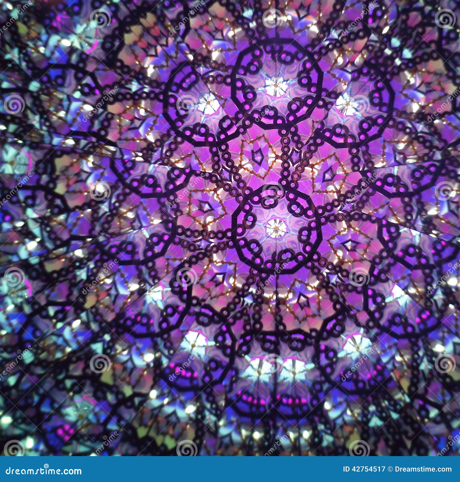
I have been looking at various images and different album artwork designs to get some inspiration and influences for my own artist. I want the album artwork to represent the track as well as the star image of the artist and I would like there to be a visual theme that could be carried from the music video into the album artwork. I have been thinking about the imagery of the tarot cards, mirrors, mazes, kaleidoscopes and illusions/mystery.


I have been looking at KT Tunstall's original album artwork for this track as well as her website to get some inspiration and see what the original is like and how I can incorporate elements of the actual artist's style and ideas into my own.
I like the original album artwork because it is simplistic and very clear to the target audience. However, I don't think that it is a very good representation of the artist's star image or of the genre of the music. I like the fact that it appears to be worn out and also I like the fact that it looks like the drawings could have been the artists own giving it a more personal and down to earth touch.
I was really surprised when I looked at KT Tunstall's website homepage because in my opinion the use of the bright colours and the image used completely juxtaposes the star image that was created in the music video making the products not work harmoniously. I don't think that the bright colours and geometric print fit with the look of the artist nor do they provide a cohesive campaign. I think that when creating my own website homepage for my artist I will use a much more discrete and mysterious colour scheme and I will make sure that there is a visual theme that matches the music video with the website as well as making sure that the artist's star image is consistent throughout the campaign.


I have been looking at other indie rock artist's websites to get some inspiration and ideas for my own website. I like the ones below because I think that the layout, colour scheme and design/imagery would work well with my artist and would fit with her star image and genre of her music. I like the use of the dark colours and the element of mystery and illusions with each of these websites and they have given me some inspiration for when I create my own website.


I have been looking at various images and different album artwork designs to get some inspiration and influences for my own artist. I want the album artwork to represent the track as well as the star image of the artist and I would like there to be a visual theme that could be carried from the music video into the album artwork. I have been thinking about the imagery of the tarot cards, mirrors, mazes, kaleidoscopes and illusions/mystery.
I really like the idea of using the image of a horse but creating a maze within the shape of a horse's head. The image of the horse not only matches the track but the horse also represents the strength of character of the artist and the characteristics of a horse match that of the star image of the artist in terms of rebellion, independence, pride and courage.

Another idea this has lead me to consider is to create my own tarot card to use as the album artwork and on the tarot card there would be a black horse as this horse represents a lot of things in the song including the artists strength and courage as well as weakness and mysterious nature. I think that the image of the horse on an old tarot card would not only work well with conveying the track, star image of the artist and the genre of the music but it would also provide a good visual theme that could be used across all three products in the campaign.


Friday, 8 July 2016
Developing ideas for digipaks and homepages for Idea 2
I have been thinking about different ideas for website designs and album artwork designs for the track 'Whose bed have your boots been under?"

I have been looking at Shania Twain's album artwork for this track and also her website to get some ideas for what the original looks like and how the artist presented her star image and visual theme on her website. I don't think that the design or colour scheme of Shania's website will be similar to that of the artist that I have created because her website focused more on her image and the colours were very dark and provided more of a pop/rock vibe rather than a country vibe. I think that instead of the dark purples I am more likely to use lighter and softer colours for the background and maybe some red to show her rebellion and slightly sexualised look. I like the rustic and vintage look to the album artwork, however I don't like the fact that the focus is entirely on her face and it appears quite outdated.


I want to make sure that the music video, website and digipak all tie in nicely together and that there is an overall visual theme across all three products. Additionally, I want to make sure that I take into account influences from the country music genre and also the fact that the artist that I have created has an organic look according to Negus' theory and is also described as youthful, creative, original and successful against the odds according to Dyer's star theory.


I want the website to represent the star image of the artist, reflect her ideology as well as work harmoniously with the other products to create a visual theme and work well with the track. This is why I think that the website should be mainly focused around the music and the tour dates etc. rather than the appearance of the artist. I don't think that there should be too many photos and visuals of the artist on the website and the website should appear organised and structured. I have been looking at Miranda Lambert, Carrie Underwood and Dolly Parton's website to get some inspiration and creative influences.


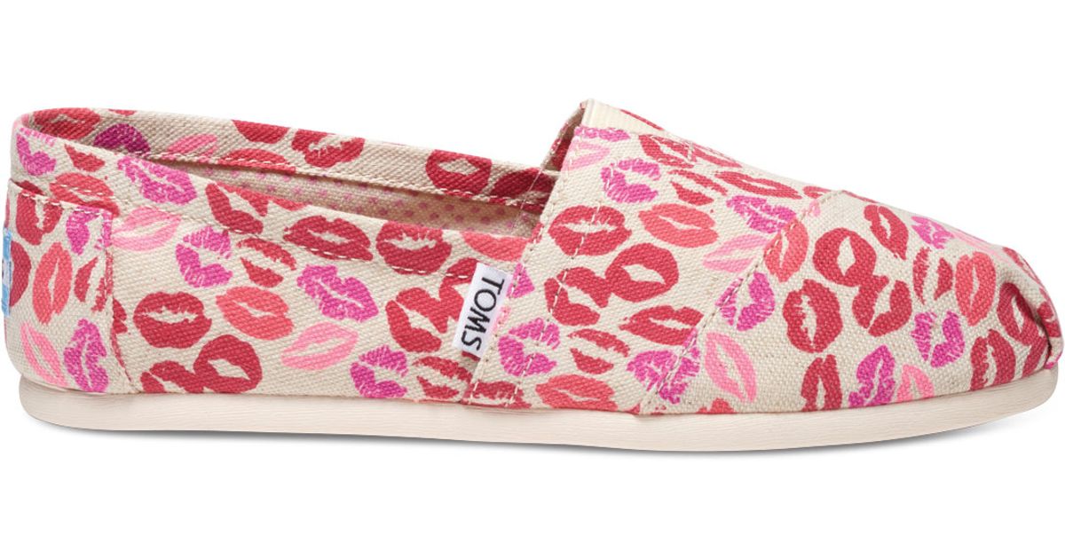
From this inspiration I thought deeper into the lyrics of the song and tried to find some inspiration from that. When thinking about the lyric 'whose lips have you been kissing?' I thought about the image of a lipstick stain which then led me to the idea of having a pair of cowboy boots with lots of lipstick stains on them which would tie in well with the narrative of the music video. The image of the cowboy boots represent the genre well and ties in nicely with the star image of the artist. the use of the red lipstick stains would also tie in with the sexual appeal of the artist as well as the cheeky and rebellious nature of the artist. Through the use of the colour red, the connotations are that of being sexy, cheeky, rebellious which would tie in appropriatelywith the three products. Below are some pictures demonstrating my ideas.


I have been looking at Shania Twain's album artwork for this track and also her website to get some ideas for what the original looks like and how the artist presented her star image and visual theme on her website. I don't think that the design or colour scheme of Shania's website will be similar to that of the artist that I have created because her website focused more on her image and the colours were very dark and provided more of a pop/rock vibe rather than a country vibe. I think that instead of the dark purples I am more likely to use lighter and softer colours for the background and maybe some red to show her rebellion and slightly sexualised look. I like the rustic and vintage look to the album artwork, however I don't like the fact that the focus is entirely on her face and it appears quite outdated.


I want to make sure that the music video, website and digipak all tie in nicely together and that there is an overall visual theme across all three products. Additionally, I want to make sure that I take into account influences from the country music genre and also the fact that the artist that I have created has an organic look according to Negus' theory and is also described as youthful, creative, original and successful against the odds according to Dyer's star theory.
I want the website to represent the star image of the artist, reflect her ideology as well as work harmoniously with the other products to create a visual theme and work well with the track. This is why I think that the website should be mainly focused around the music and the tour dates etc. rather than the appearance of the artist. I don't think that there should be too many photos and visuals of the artist on the website and the website should appear organised and structured. I have been looking at Miranda Lambert, Carrie Underwood and Dolly Parton's website to get some inspiration and creative influences.


Below are some images that I have drawn inspiration from and that I think would work well with the visual theme for this artist. I like the bright colours, the vintage look and also the focus on the rustic country style. I would like to incorporate the image of some cowboy boots into the digipak and website as not only do they fit with the track but they also represent the genre well and would fit with the artist's look.
From this inspiration I thought deeper into the lyrics of the song and tried to find some inspiration from that. When thinking about the lyric 'whose lips have you been kissing?' I thought about the image of a lipstick stain which then led me to the idea of having a pair of cowboy boots with lots of lipstick stains on them which would tie in well with the narrative of the music video. The image of the cowboy boots represent the genre well and ties in nicely with the star image of the artist. the use of the red lipstick stains would also tie in with the sexual appeal of the artist as well as the cheeky and rebellious nature of the artist. Through the use of the colour red, the connotations are that of being sexy, cheeky, rebellious which would tie in appropriatelywith the three products. Below are some pictures demonstrating my ideas.
Subscribe to:
Comments (Atom)