Firstly, I took a look at the original album artwork and Lennon and Maisy's website to see what they were like and see if I could draw some inspiration from these. I like the fact that the original album artwork is quite simplistic and the use of the black and white gives it a classic and almost vintage look. The use of the bright yellow for the word yellow makes it stand out and also makes it quite fresh and youthful. I like the fact that their picture is on the album artwork however it is not the main focus of the artwork and I want to try and incorporate this idea into my own album artwork. I really like the design of their website as it is made to look like the information is pinned onto a vintage fridge which really fits their star image and I think that this is a really fun idea which I was definitely inspired by. The use of the vintage floral pattern in the back and the turquoise fridge gives them a vintage look but also makes them look fun and classic. I also like the fact that similarly with their album artwork that their image is not the main focus of their website and that their music and tour take up more of the focus.
Some other websites that I have drawn inspiration from are shown below. I like these websites due to their layout, colour scheme and also how they have presented the band. I think that these websites have elements that I can use as inspiration when creating my own website for the duo.
I want the album artwork and the website to not only match the look of the music video but to also tie in nicely with the organic image of the duo as well as their star image and the genre of their music. I want the album artwork and website to represent their creativity, originality and youthfulness as well as the indie genre and their bohemian and fresh style. Additionally, I think that the album artwork and website should reflect the ideology of the duo and the meaning behind the song, therefore having an element of memories, nature, the environment and even the contrast with modernising and developing world.

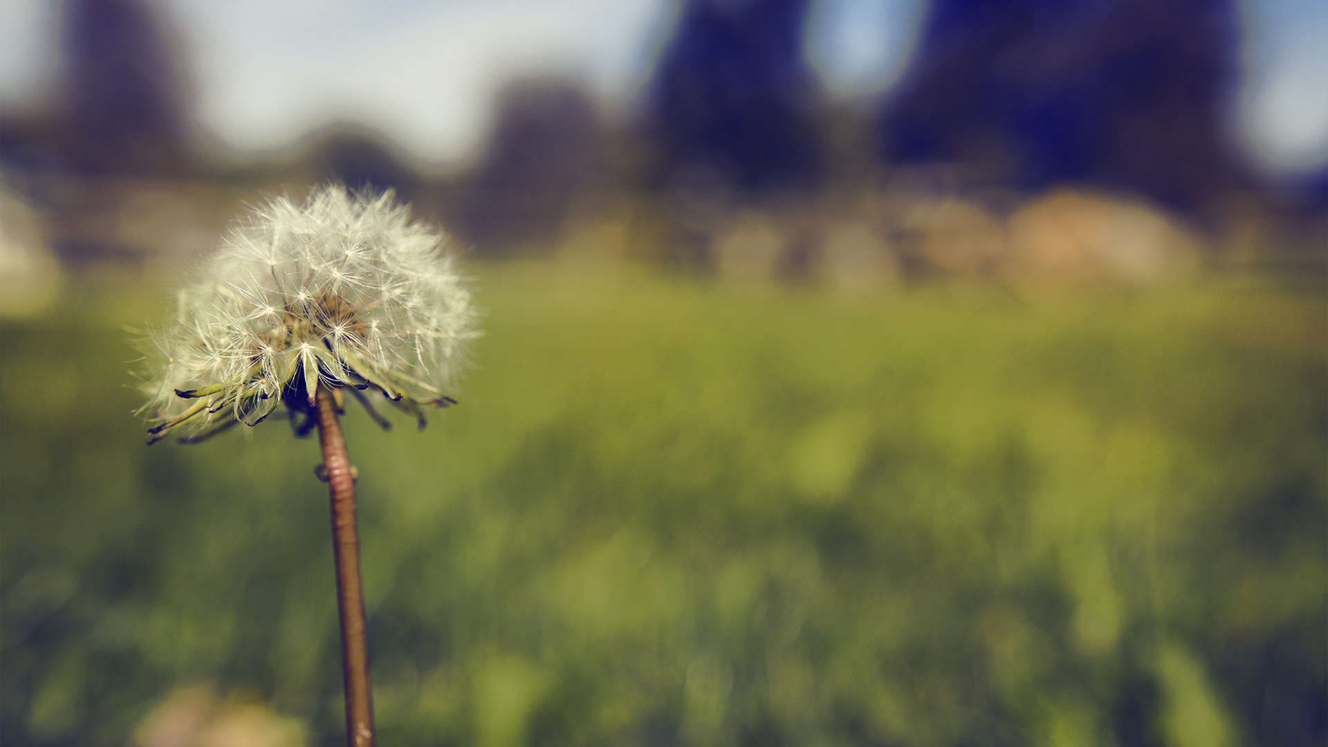
I have been looking at lots of different images which have provided me with some inspiration for my overall idea. Below are some pictures showing some of the images that have influenced my idea.

My final idea for the album artwork for this duo have further developed into creating a collage of pictures and tickets and pressed flowers etc. representing childhood memories and how the things that they cherish in the photos have been lost due to the changing, modernising and developing world. I believe this will tie in well with the music video concept and also with the star image of the duo. The collage will include lots of polaroid pictures of children playing, a vintage yellow car, nature, flowers etc.


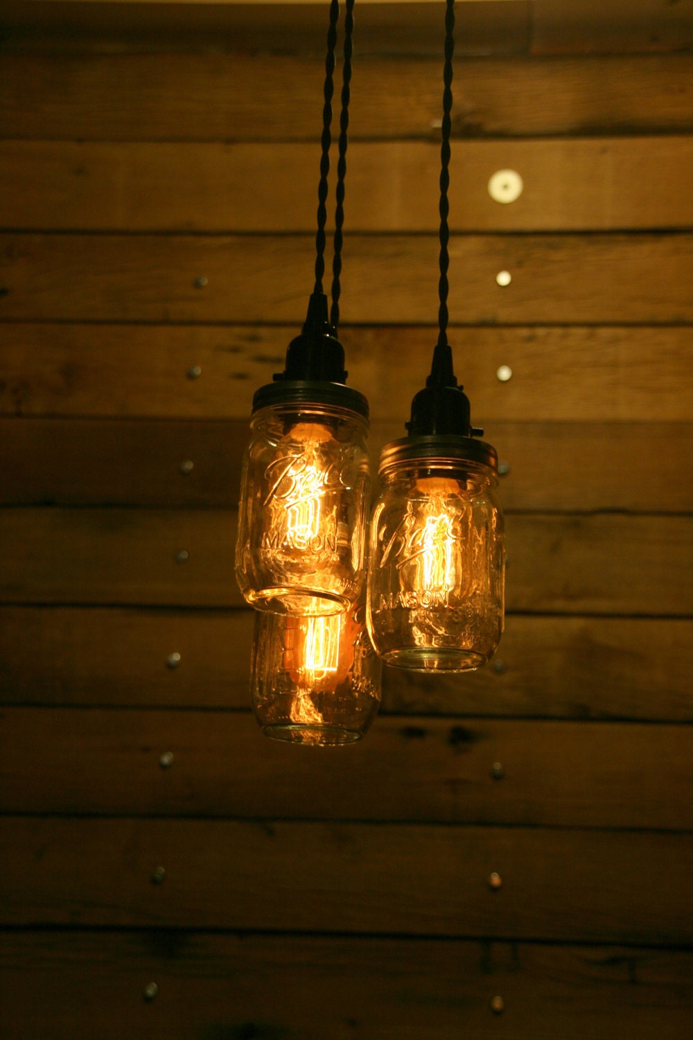
It will also include a polaroid picture of the two girls making up the duo so that they are featured on the album artwork yet they are not the focus of it nor the most important part of it. I also really like the image of mason jars with lights in them and I think that they would work really well with the music video idea as well as being able to incorporate them onto the album artwork and maybe even use the image as a border along the top of the website. I think that the use of the mason jars with lights in them work well with the duo's look and also work well with the track and genre of the music that the duo create.

Overall, I think that the ideas that I have come up with would create a good visual theme across all three products and would tie in nicely with the ideology of the duo, the star image of the duo and also the track and the meaning of the song.


No comments:
Post a Comment