Friday 9 December 2016

Website first draft

Chris was assigned the task of creating a first draft for our website as he has good skills and is very familiar with WIX and so was enthusiastic about taking on this task. 


He came up with the band name 'B-side label' which he believed was alternative, however not too wacky. I think that this name is good however, I am not sure whether it fits with the star image of the band as much as we would have liked it to but it is a good start point. 

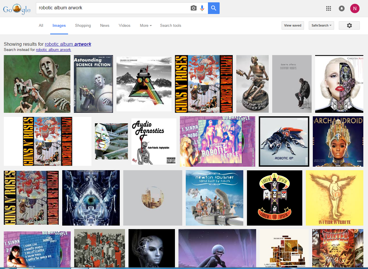
The imagery that Chris has used is based off our initial idea of using robots to represent the band. I think that imagery he has chosen works well for the star image of our band as well as working well with the USP of the band. My only concern is that it may look too science fiction like and therefore not reflect the electro swing genre effectively. 


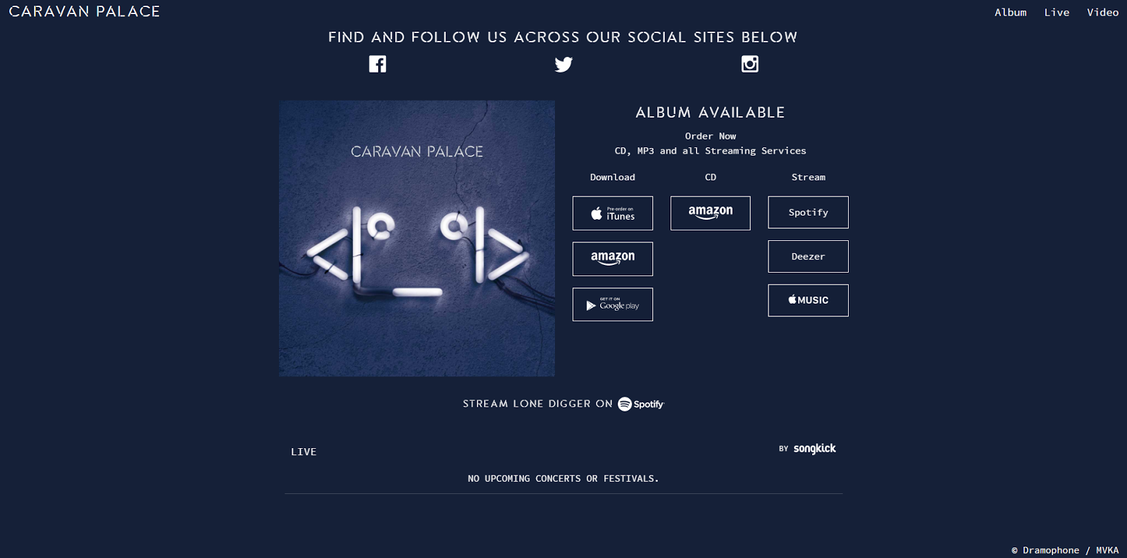
This is the first draft design for the homepage of the website which is what the users will see when they first look at the website. Chris chose an abstract photo of a robot which has a science fiction style to it and he decided to put a black and white filter onto it on order to make it fit with the 1920's style of our campaign and therefore it ties in nicely with the digipak design. 

I really like how the homepage looks but I think that it may be slightly too simplistic and plain and it may not attract the audience's attention due to the lack of colour and unique style. 


He also added in a biography section in order to provide the audience with a range of things including a general introduction to the band members with hints as to what their star image and USP contain. The biography also contains information about the genre of music they create, promotional tools for their latest album and most importantly their latest single which we are promoting; 'Beatophone.'

I like the design that Chris has come up with for the first draft of the website as I like the colour scheme and the imagery that he has chosen. However, I do think that it may be slightly too simplistic and minimalist but for a first draft I was very impressed. 

Thursday 8 December 2016

CD Digipak first draft

Due to the fact that we were each assigned with different task to complete this week in order to get the tasks completed in a more organised fashion, Evelyn decided to take ion the role of designing the first draft fro the CD Digipak as she has the best skills with Adobe Photoshop and so she would do the best job at this task. 

Here is Evelyn's design for the first draft of the CD Digipak: 

The design that Evelyn has come up with is nothing like we had discussed and so it was quite a shock when she first showed it to us, however I do like it and I think for a first draft it is very impressive. I think that the colour scheme works well with what we have been thinking about and it reflects the genre well but I would like to see the next draft include the imagery of the robot that we have discussed as a group. 

Here is a video showing the process that Evelyn went through in order to make the design using Adobe Photoshop:

Wednesday 7 December 2016

Audience Feedback

We have decided to get some audience feedback on our music video to see what the strengths and weaknesses of the video are. This has helped us to see what additions and changes the test audience have suggested for our product and it allowed us to see whether the audience's views are similar to our views.

From the audience feedback we received we were able to see that the audience thoroughly enjoyed our music video and the concept of the scientist mixing chemicals and this causing the time leap from the 1920's to the future was clear and enjoyed by the audience. However, the audience appeared to think that the 3 dancers were aliens during the futuristic section which was not our intention and there were mixed views about the mad scientist as half of the audience said that they liked the scientist and that they wished he had been more wacky and featured more throughout the video, whilst the other half discussed the fact that they didn't think that the actor playing this role was right for the role and that they thought that these sections were quite weak.

The audience also suggested that we could have introduced the futuristic section earlier on within the video and this would have made the two elements even in terms of how much they were shown throughout the music video. Despite this, they all said that they were very impressed with the mise-en-scene and art direction in the video and that the set design was particularly detailed and visually striking. 

I think that our audience feedback has been very useful and I believe that our views coincide with that of the audience and I think that this was a helpful process in order for us to see how we could have improved the video.

Here is the audience feedback video that I created:


Brainstorming ideas for the band name

I have been thinking about some options for the band name as we need to come up with something quickly so that we can include it n our website and digipack first designs. 

One of the first options I came up with was PORTMANTEAU which means a linguistic blend of words. I thought that this would be appropriate as it is quite an ambiguous and obscure word but its meaning ties in nicely with the fact that the band blend elements of the old and new in terms of the 1920's origin of the fact that they are a jazz band but then they combine this with the new by making their music more funky and contemporary. This also ties in well with the band's USP and so i think that this would be a good option for the band's name. 


The next option that I came up with was THE QUANTUM MECHANICS which relates to the theme of time travelling which is explored within the music video we have created. I like this name as it relates to the scientific element of the music video and it also ties in well with the idea o time travel which again relates to the band's USP.  I think that this name might be too long however and so it may not work as well as some of the other options. 

The other option I came up with was OXYMORON as this refers to when two words contradict each other. I think that this could be a good option as the word itself is quite obscure and ambiguous and its meaning relates to the combination of the old and new that the band explore in their USP. I think that this would work well as a band name but I am not sure whether it is too literal and doesn't leave enough room for interpretation on the part of the audience. 


I think that all three of these options are good possibilities for band names but I think that we are going to need to do a bit more brainstorming in order to come up with something that works really well and fits the USP and star image of our band really well as well as working well with the other products that make up the band's music campaign. 

Last stages of editing...

Image result for audience preview

We are coming up to being in the last stages of the editing of our music video which is great news. We have been cutting clips together, syncing them up, choosing clips and changing clips throughout the editing process and we are now at the stage where we are about the colour grade our music video and then it will be finished and ready to show to audiences. 

Image result for colour grade

We have decided not to create a rough cut of our video as we thought that this would not be very helpful as we wanted to just get started with a really good version that was carefully and professionally edited and so we decided to spend more time on getting it right the first time around so that we didn't have to create lots of rough drafts and rather just one really good cut. 

The next stage of our editing process is to colour grade the entire thing so that it looks cohesive and so that the various elements which used different colours and lighting look good together. 

Image result for colour grade

When we have finished the editing of our music video and we have a final product we are going to screen it to a preview audience and record their feedback so that we can see what the strength and weaknesses are according to the audience and this will help us to make some last minute tweaks, additions and changes depending on their suggestions before posting it on YouTube for audiences. 

I think that this audience feedback will be very useful as it will help us to identify strong and weak areas of our music video and will hopefully aid us in creating the best video that we could possibly create. 

Image result for audience feedback gif

Conventions of Websites

Due to the fact that we are going to be creating a website for our own band using WIX I thought it would be appropriate and useful if I did some research int the conventions of websites and had a further look into what a website involves and how it is used a s a promotional product as part of a music campaign.

Image result for wix website

A website homepage is the first page of the website that users will come across and this page usually contain s links to other pages, such as a merchandising page, tour dates and band biography. 

Websites contain information which publicises and promotes the artist image and a range of information and images to an audience or a fan base. Often this is organised into what Boyd has termed co-option - the invitation to join the community and take part. 

Image result for website homepage band

When creating the website for our band we need to consider how it is going to present the band's star image as well as their USP. Through my research, I discovered that media marketing of the pop star image have become iconic and famous and iconic images have helped retain the popularity of existing and legendary artists. 

All music websites are about promotion and information provided to the audience. They fall into three main categories; promotions of a single or album release, promotions of a tour or live appearance, merchandising - posters and t-shirts for sale. I think that our website is most likely to be promoting the album that we have created as well as some additional elements of upcoming tour dates and merchandise that is available to purchase. 

Image result for website homepage band

A website's home page is usually the most important page and it contains various elements. These conventions provide information in their own right or offer the audience the opportunity to interact with the page, share it and navigate to other parts of the page or website. Although the content varies on different home pages, there are similar conventions which are used such as the fact that the layout of many websites follow a similar pattern or template. From my research, I found out that any variations are dependent upon the purpose of the website and the needs of the target audience. 

Image result for website homepage band

From looking at a variety of website homepages from different genres I discovered that they all consist of the same visual and technical coding that are stylised in different ways to reflect the  star image represented and the brand that the band want to promote. 


I would like to take on board the things that i have learnt through this research into the conventions of websites when creating my own website and it would be great if we could allow the website to reflect the star image and USP of the band as well as help to promote the artist and the other products (album and music video) that make up the rest of the music publicity campaign. 

Tuesday 6 December 2016

CD Digipak planning

We have been continuing to plan the Cd Digipak and in particular we have been considering the colour scheme that we could use as well as what the robot imagery would look like.

I think that the colour scheme for the website and digipak would be in the colour spectrum of black, copper and gold due to the fact that these colours are  warm and represent the 1920's era well and also tie in nicely with the colours used in the music video. Additionally, I think that these colours go well together and I think that they will work effectively for the CD Digipak as well as possibly being successful colours for the website as well. 

This is the colour scheme we are thinking of using across our music publicity campaign

Here is the robot design that Evelyn created as we were trying to see whether the moustache would work effectively for the robot or whether it looks too childish and out of place. However, we decided from this that it doesn't matter whether the robot has a moustache or not as we think that the design we have chosen for the robot may not be as effective as we had initially thought. 


Therefore Evelyn has decided to try and design something completely different for the first draft of our CD Digipak and she is thinking of going down a more mechanical route with this design. 

Monday 5 December 2016

Developing ideas for the digipak and website

We have been developing our ideas for the digipak and website and considering how we can make it tie in better with the star image of the band as well as how can we make it more aesthetically and visually striking for the target audience. 

One of the things that we discussed as a group was the imagery we have chosen for the digipak and website and we discussed whether the robot appeared too cute and childish and whether it was reflective and appropriate for our band's star image. We talked about how the use of the mustache made his appear too innocent and like a children's cartoon character and how this wasn't what we were going for and so we decided to adapt the imagery and make it more robotic and less cute. I think that the less cute version of the robot will work much better are conveying the star image we have com up with for our band and it will also work much better at attracting the right audience for the album and website. 

Here is the new imagery we have come up with for the robot

We have also been thinking about how we can adapt the website idea to make it incorporate the new, less cute version of the robot and how we can make the website appear more sophisticated and professional than the first draft that we did. 
This is the first draft for our new website idea
We decided that we could use the same imagery for the website as is used for the digipak as this would help to link the two products together and create a cohesive campaign. We thought that we could use the imagery of the robot for the side of the website and have it fading into the black to make the website a bit more mysterious and exciting for the audience. I think that this will work effectively for our website as it will reflect the star image we are creating for the band. 

We have then been considering ideas for a colour scheme for the website and we have been thinking about using quite muted, simplistic and basic colour scheme as we think that minimalism will work well with the star image of the band as well as the fact that this will match their organic image. We are considering using black for the background and then metallic colours for the image of the robot as well as the text on the website. I think that these colours will compliment each other well and I think that they will reflect the USP of the band effectively. 

Image result for metallic texts

Thinking about the Star Image and USP

After starting design the digipak and website for our band I have been thinking about what kind of star image we are trying to create for the band as well as what their USP could be and how these could be reflected in the music publicity campaign.

When considering the band's star image I thought about how I wanted them to be viewed by their audience and how I wanted them to come across in their products. I think that their image should be youthful as this will make them more attractive for their target audience. I also think that it is important that their star image reflects the fact that their are creative, imaginative and original and that their music and ideas are expressing something new and current and this will attract audiences. 

I have created a word cloud to try and brainstorm some ideas for their star image

In terms of the band's USP I think that is probably the fact that their music is rooted in 1920's jazz and despite this they are able to put a modern twist on it by adding elements of electronic music making it more contemporary and therefore more engaging for modern audiences and fans. I think that this is very special as they are continuing the use old instruments but they are making current and up to date music. In my opinion, our idea of using a robot as imagery for the digipak and website fits this well and I think that it is reflective of both their star image and their USP.


Image result for unique selling point  

Thursday 1 December 2016

Researching the Thai langauage

Due to the fact that we ave come up with the initial idea of using Thai for the album name I decided to do some research into the Thai language and what the letters look like. 

We are currently thinking that our album name is going to be BOLT in Thai.


I think that the Thai language looks very illustrating and the letters appear very stylised and I found that the letters almost look like art in themselves rather than letters. I think that the use of Thai could work really well for our album artwork as it would be quite ambiguous and it would provide something different for the star image of the band. 

Here are some images of the Thai language and alphabet:

Image result for thai language

Image result for thai language

Image result for thai language

Researching Robot Drawings

Due to the fact that we have decided to go with a drawing of a robot for the front cover of our album artwork  for he time being I decided to have a look at some images of robot drawings online to get some inspiration. 

Here are the results from researching into robot drawings:

Here are some robot sketches that I found online:

Here are some images of cute robots that I found online:


We would like our robot to look cute, funky and also have a bit of a 1920's style to him such a having big rounded glasses and a mustache as shown in the initial sketch that we have drawn. Here is the sketch that Chris and I came up with for an initial idea of hat we want our robot to look like:

Wednesday 30 November 2016

Researching ideas for album artwork

I have been doing some research by looking at images online in order to get inspiration for our album artwork.

We first looked at Caravan Palace and noticed how they have a running theme of combining robots and jazz instruments. We were very inspired by this concept and we want to develop this further. 


I then had a look at electo swing album artwork and noticed that this all seemed a bit too old and outdated for our audience. We have therefore decided that we are likely to avoid using this style of artwork as we don't think that it will fit with our band well. 


Finally, we looked at robotic album artwork and we were inspired b the use of robots and again we want to develop this idea further, but crate something less intense and freaky and rather something cute and fun for our audience as we want the robot to match the star image we are trying to create for our band. 


Sketching Ideas for the Website

We have started to sketch out some ideas for the website for our artist. From my research, I know that the purpose of a website is to promote the artist/band and therefore it works as a platform for publicity and promotion. Therefore, it is important that the band is represented well in the website and their star image is clearly portrayed.


We are still trying to come up with a band name for the campaign and so we have been coming up with ideas for this, but we are still trying to come up with a final one that we can all agree on.

When sketching out our ideas for our website we first considered using imagery that was used within the music video, however we realised that this would be too similar to the music video and wouldn't represent the band well as it is too much like the mad scientist character from the music video.

We then decided that we could use the imagery of the robot from the album artwork that we have come up with and change it slightly so that the robot is lying down underneath the band name at the top of the website homepage in a cheeky way. This would link the album artwork and the website and it would also reflect the cheeky and lighthearted nature of the band.


We are still in the process of sketching and designing our website. I feel like we need to discuss this as a group before we start to make a first draft in Wix.

Tuesday 29 November 2016

Sketching Ideas for the CD Digipack

We started sketching our initial ideas for the CD digipack today ad we were trying to come up with idea of some imagery that we could use on our digipack to help us represent the star image of the artist/band.


Through this process we discovered that it is important that we are not too literal with our imagery ad that we don't use imagery that has been used in the music video as this will be boring for the audience as it is predictable. This helped us to avoid certain imagery that was used a lot within our video such as the goggles, scientist equipment and the mad scientists face.


This process also helped us to realise that we are not creating a star image for the mad scientist but rather he is just playing a cameo role and he is just a featured artist on the track and actually he band we are trying to represent consists of the pianist, violin player and saxophone player that formed the band. We then had too consider how we wanted to preset this group of people and what we wanted their star image to be like.

I came up with the idea of using the imagery of some iron lungs but manipulating it so that it looks like a music instrument, possibly resembling a french horn. I think that this could be a very cool idea as it could link our idea of robotic things and advances in science as well as trying in nicely with the fact that the band are an electro swing band therefore play jazz instruments.


We started the explore the idea of robots and robotic style imagery and we were inspired to create an image of a cute robot which we the decided that we liked and that it fits the star image of the band and it also ties in nicely with the music video. I really like the sketch of the robot that Chris created as I think that this could look really good on our digipack and it could be created using animation and graphic design.


We then began brainstorming ideas for the name of the album and at first I  suggested that we could look up the name for the fear of time travelling as this idea of time travel is reflected in the music video and I thought that this word would be quite cool and abstract but we decided against this idea as we thought that it was too ambiguous. I then had the brilliant idea of using Thai due to the fact that Chris is Thai and therefore he knows the language well. I thought that we could think of a word that looks cool in Thai as I thought that the language is quite ambiguous and it is symbolic and looks like a cool font and therefore would intrigue the audience. We were still thinking of the idea of time travelling and so Chris began researching alternative words and he came up with the idea of bolting time, however we realised that this doesn't make much sense. But, from this the idea of 'BOLT' came about and we liked this idea and so for the time being we think that our album is going to be called BOLT in Thai.


The next stage is coming up with a name for the band which will tie in nicely with the star image that we have created and will also fit the genre of music well. We are still trying to come up with an appropriate name and this will be put on the front cover of the album as well as the spine.

Monday 28 November 2016

Brainstorming ideas of a music publicity campaign - Websites

In terms of websites I have been looking at websites for similar bands and artists and I have been looking at the fonts, colour schemes, imagery and features that they typically use to see whether I can get any inspiration from it. I like the look of he the following websites as I like the use of genre conventions as well as the imagery that they have utilised. I think that these websites could provide a useful starting point for us to base our website off of.

I don't know whether I would like to go down the futuristic route and use this element form the music video as inspiration for the website or whether I would like to take inspiration from the 1920's element. I think that this decision would massively effect the overall look of the website as well as the type of audience that it would attract. I would like to come up with a way that we can showcase the transition from old to new within the website, however I am unsure as to how exactly I would like to do this.

It would be really cool if we could figure out a way to have a feature of a chemical reaction occurring which allows the website to load as this would tie in nicely with the mad scientist element of the music video as well as fitting in well with the idea of transitioning and changing from old to new.


I think that the research that I have conducted into other websites that are of the same genre as the one we are creating will help us with getting inspiration from real products and finding out more about what is out there for audiences at the moment and what campaigns are successful and why that is. I am looking forward to sharing my ideas and research with the other members of my production group and seeing what they have found and what idea they have. Hopefully we have gathered some good researched and been inspired by other products and this will help us to create an effective and coherent music publicity campaign. 

Brainstorming Ideas for a music publicity campaign - Album Artwork

I have been thinking about ideas for a music publicity campaign as I have been thinking about how the music video that we are creating would link with a piece of album artwork and website for the artist that we have created. I want to create a website and album artwork for the artist that not only ties in with the themes and idea of the track that we have used for our music video but also works harmoniously with the other tracks on the album and creates a universal message and has a universal themes across all three products of the music publicity campaign.

I have had ideas about incorporating element of the 1920's into the album artwork and website as well as utilising the futuristic element into the other products. I have also considered using the theme of the scientist or some sort of chemical reaction as well as something more deep and meaningful which could be interpreted from the music video and then put in place for the other products that make up the rest of the music publicity campaign.

Here are some images that have inspired me:
Image result for half robot half humanImage result for half robot half humanRelated imageRelated imageImage result for old jazz instrumentsImage result for old jazz instrumentsImage result for chemical reaction photographyImage result for science artworkImage result for half robot half human hand

Image result for album artwork electro swing

I really like this album artwork which is from a different Caravan Palace album as I really like how they have linked the old and the new with the use of a grammarphone and a robot. I think that this concept could work well for our album artwork in order to link the 1920's element and futuristic element that are showcased in the music video we have created.
Image result for album artwork electro swing


I was really inspired by Christina Aguilera's album artwork for Bionic as this is exactly what I was envisioning for the album artwork as I think that it will help us link the 1920's element and the futuristic elements together and it will also create a theme of everything evolving and becoming robotic and mechanical.

Image result for robotic  album artwork

I think that the research that I have conducted into imagery for the album artwork of the same genre as the one we are creating will help us with getting inspiration from real products and finding out more about what is out there for audiences at the moment and what campaigns are successful and why that is.

I am looking forward to sharing my ideas and research with the other members of my production group and seeing what they have found and what idea they have.

 Hopefully we have gathered some good researched and been inspired by other products and this will help us to create an effective and coherent music publicity campaign.