Wednesday 30 November 2016

Researching ideas for album artwork

I have been doing some research by looking at images online in order to get inspiration for our album artwork.

We first looked at Caravan Palace and noticed how they have a running theme of combining robots and jazz instruments. We were very inspired by this concept and we want to develop this further. 


I then had a look at electo swing album artwork and noticed that this all seemed a bit too old and outdated for our audience. We have therefore decided that we are likely to avoid using this style of artwork as we don't think that it will fit with our band well. 


Finally, we looked at robotic album artwork and we were inspired b the use of robots and again we want to develop this idea further, but crate something less intense and freaky and rather something cute and fun for our audience as we want the robot to match the star image we are trying to create for our band. 


Sketching Ideas for the Website

We have started to sketch out some ideas for the website for our artist. From my research, I know that the purpose of a website is to promote the artist/band and therefore it works as a platform for publicity and promotion. Therefore, it is important that the band is represented well in the website and their star image is clearly portrayed.


We are still trying to come up with a band name for the campaign and so we have been coming up with ideas for this, but we are still trying to come up with a final one that we can all agree on.

When sketching out our ideas for our website we first considered using imagery that was used within the music video, however we realised that this would be too similar to the music video and wouldn't represent the band well as it is too much like the mad scientist character from the music video.

We then decided that we could use the imagery of the robot from the album artwork that we have come up with and change it slightly so that the robot is lying down underneath the band name at the top of the website homepage in a cheeky way. This would link the album artwork and the website and it would also reflect the cheeky and lighthearted nature of the band.


We are still in the process of sketching and designing our website. I feel like we need to discuss this as a group before we start to make a first draft in Wix.

Tuesday 29 November 2016

Sketching Ideas for the CD Digipack

We started sketching our initial ideas for the CD digipack today ad we were trying to come up with idea of some imagery that we could use on our digipack to help us represent the star image of the artist/band.


Through this process we discovered that it is important that we are not too literal with our imagery ad that we don't use imagery that has been used in the music video as this will be boring for the audience as it is predictable. This helped us to avoid certain imagery that was used a lot within our video such as the goggles, scientist equipment and the mad scientists face.


This process also helped us to realise that we are not creating a star image for the mad scientist but rather he is just playing a cameo role and he is just a featured artist on the track and actually he band we are trying to represent consists of the pianist, violin player and saxophone player that formed the band. We then had too consider how we wanted to preset this group of people and what we wanted their star image to be like.

I came up with the idea of using the imagery of some iron lungs but manipulating it so that it looks like a music instrument, possibly resembling a french horn. I think that this could be a very cool idea as it could link our idea of robotic things and advances in science as well as trying in nicely with the fact that the band are an electro swing band therefore play jazz instruments.


We started the explore the idea of robots and robotic style imagery and we were inspired to create an image of a cute robot which we the decided that we liked and that it fits the star image of the band and it also ties in nicely with the music video. I really like the sketch of the robot that Chris created as I think that this could look really good on our digipack and it could be created using animation and graphic design.


We then began brainstorming ideas for the name of the album and at first I  suggested that we could look up the name for the fear of time travelling as this idea of time travel is reflected in the music video and I thought that this word would be quite cool and abstract but we decided against this idea as we thought that it was too ambiguous. I then had the brilliant idea of using Thai due to the fact that Chris is Thai and therefore he knows the language well. I thought that we could think of a word that looks cool in Thai as I thought that the language is quite ambiguous and it is symbolic and looks like a cool font and therefore would intrigue the audience. We were still thinking of the idea of time travelling and so Chris began researching alternative words and he came up with the idea of bolting time, however we realised that this doesn't make much sense. But, from this the idea of 'BOLT' came about and we liked this idea and so for the time being we think that our album is going to be called BOLT in Thai.


The next stage is coming up with a name for the band which will tie in nicely with the star image that we have created and will also fit the genre of music well. We are still trying to come up with an appropriate name and this will be put on the front cover of the album as well as the spine.

Monday 28 November 2016

Brainstorming ideas of a music publicity campaign - Websites

In terms of websites I have been looking at websites for similar bands and artists and I have been looking at the fonts, colour schemes, imagery and features that they typically use to see whether I can get any inspiration from it. I like the look of he the following websites as I like the use of genre conventions as well as the imagery that they have utilised. I think that these websites could provide a useful starting point for us to base our website off of.

I don't know whether I would like to go down the futuristic route and use this element form the music video as inspiration for the website or whether I would like to take inspiration from the 1920's element. I think that this decision would massively effect the overall look of the website as well as the type of audience that it would attract. I would like to come up with a way that we can showcase the transition from old to new within the website, however I am unsure as to how exactly I would like to do this.

It would be really cool if we could figure out a way to have a feature of a chemical reaction occurring which allows the website to load as this would tie in nicely with the mad scientist element of the music video as well as fitting in well with the idea of transitioning and changing from old to new.


I think that the research that I have conducted into other websites that are of the same genre as the one we are creating will help us with getting inspiration from real products and finding out more about what is out there for audiences at the moment and what campaigns are successful and why that is. I am looking forward to sharing my ideas and research with the other members of my production group and seeing what they have found and what idea they have. Hopefully we have gathered some good researched and been inspired by other products and this will help us to create an effective and coherent music publicity campaign. 

Brainstorming Ideas for a music publicity campaign - Album Artwork

I have been thinking about ideas for a music publicity campaign as I have been thinking about how the music video that we are creating would link with a piece of album artwork and website for the artist that we have created. I want to create a website and album artwork for the artist that not only ties in with the themes and idea of the track that we have used for our music video but also works harmoniously with the other tracks on the album and creates a universal message and has a universal themes across all three products of the music publicity campaign.

I have had ideas about incorporating element of the 1920's into the album artwork and website as well as utilising the futuristic element into the other products. I have also considered using the theme of the scientist or some sort of chemical reaction as well as something more deep and meaningful which could be interpreted from the music video and then put in place for the other products that make up the rest of the music publicity campaign.

Here are some images that have inspired me:
Image result for half robot half humanImage result for half robot half humanRelated imageRelated imageImage result for old jazz instrumentsImage result for old jazz instrumentsImage result for chemical reaction photographyImage result for science artworkImage result for half robot half human hand

Image result for album artwork electro swing

I really like this album artwork which is from a different Caravan Palace album as I really like how they have linked the old and the new with the use of a grammarphone and a robot. I think that this concept could work well for our album artwork in order to link the 1920's element and futuristic element that are showcased in the music video we have created.
Image result for album artwork electro swing


I was really inspired by Christina Aguilera's album artwork for Bionic as this is exactly what I was envisioning for the album artwork as I think that it will help us link the 1920's element and the futuristic elements together and it will also create a theme of everything evolving and becoming robotic and mechanical.

Image result for robotic  album artwork

I think that the research that I have conducted into imagery for the album artwork of the same genre as the one we are creating will help us with getting inspiration from real products and finding out more about what is out there for audiences at the moment and what campaigns are successful and why that is.

I am looking forward to sharing my ideas and research with the other members of my production group and seeing what they have found and what idea they have.

 Hopefully we have gathered some good researched and been inspired by other products and this will help us to create an effective and coherent music publicity campaign. 

Thursday 24 November 2016

Similar Products - Websites

I have been looking at artists and bands of the same genre as the one we have created and I have been looking at their website to try and get some inspiration for my own design for our website. I have been looking at the colour schemes that they have used, layout, features, conventions and style in order to gt some inspiration and also to see what artists and bands of the elector-swing genre's websites are like. 


WEBSITE 1

The first artist that I came across was Tape Five who are also an electro-swing band and I have been looking at their website. I like the use of the simplistic colour scheme and plain background and use of neutral colours as it makes it easy on the eye for the audience. 


The use of the features such as promoting their latest album, their merchandise and their concerts are well presented as they are fun and out there and stand out against the plain background colours. The layout is quite simplistic too as the information is in a linear fashion and appears to be quite well organised. 

I think that the use of the generic convention of the heading at the top of the page like home, contact, shop, about etc. are quit effective as they are in a simplistic and bold font and they are easy for the fans to see and find. 


The style of the website is quite boring and dull however as the use of the plain colours doesn't captivate my attention and the use of the plain colours makes the big bold adverts stand out and they appear a bit too overwhelming. 


From this research, it helped me realise that I would like to use quite a simplistic layout for our website and use the convention of the tabs to the other pages at the top of the homepage. However, I was not inspired by the overwhelming advertisements of their merchandise, concerts and album as it felt too much for me and it didn't work very effectively with the neutral background colours. I also felt that the text wasn't large enough and that it could have been made easier and more inviting for fans and this is something that I would like my website to be.

WEBSITE 2

The other website that I had a look at was Postmodern Jukebox's official website. They are also a band from the same genre that I have created and so I wanted to see if I could get any inspiration from their website. 

The first thing I noticed was the use of a clear and effective, yet quite simplistic colour scheme which I thought was highly effective and I liked the fact that style was very reflective of the 1920's which is something that ties in nicely with the genre and it also would work nicely for my website due to the fact that we incorporated a 1920's jazz club into our music video. 


Th features for the merchandise,buying their album, concerts and subscribing for more information were well placed and noticeable for the fans, however they were not too overwhelming and stuck with the 1920's style of the rest of the website. 

I really liked the use of the visuals as they helped to break up the use of text and I also really liked the feature which allowed you to 'read more' about each of the posts on the website as this allowed the audience to dictate how much they read and how much information they were absorbing. I would really like to include this in our website as I think that it intrigues fans and it also helps them to find what they are looking for and read more about the things that they are interested in and skip past the things that don't interest them. 


I wasn't particularly fond of the background colour choice of grey as I found it made the other texts boxes appear dull and boring and so if I were  to take inspiration from this website I would experiment with the use of a dark red which would tie in nicely with the 1920's style. 

I liked this website as I really liked the 1920's style and I think that this would work well for our website. I thought that the layout was effective but I would like to change the background colour to something more rich and darker and I would also like to try and make it appear modern despite using the old style as I don't want it to be dull or too old for our audience. 


WEBSITE 3

The final website that I have been looking at I that of Parov Stelar who is an electro swing artist. I came across his website and I thought it looked quite unique and different and it stood out for me. This is the first thing you see when the website loads and you have to click enter homepage.


I really like the fact that when you click on the different words like videos, gallery, music, contact etc. it takes you to a new page as I think that this adds an element of curiosity for the reader as thy have to click on things to discover more and I think that the feature of making the website interactive between the audience and the artist makes it engaging and exciting for the audience member and so i would really like to somehow use this concept within our website. 


I also really liked the fact that each of the pages was quite simplistic and minimalist in terms of the use of imagery, colour scheme and amount of information. I thought that this was very effective as it wasn't overwhelming for the audience and I thought that the minimalism worked effectively as it draw in the audiences and grabbed their attention. I would like to try and use a minimalist style for our website as I think that i would work well for our concept. 


I realised that the convention of the words that link to different pages is used a lot for artist/bands's website and so I want to try and include this convention but do something different with it and use the interaction that this website had. 


From this research I realised that I wanted to incorporate element form all three of these websites as they each inspired me in different ways in terms of the conventions, style, features etc. I would like to use a simplistic layout and a basic colour scheme that ties in nicely with our theme and concept as well to use some interesting features where the reader has to click on things in order to find out more as I want my website to be interactive, engaging and easy on the eye as well as the fact that I want it to tie in nicely with the other elements of the campaign. 

Similar Products - CD Digipaks

I have been researching designs for CD digipaks and I have been looking specifically at album artwork from similar artists of the same genre. I have been looking at these pieces of album artwork to get some inspiration for designs for my own album artwork. I would like the album artwork to reflect the star image of the artist as I believe that this is important so that fans can get an idea as to what the artist is like. 

Image result for cd digipaks

ALBUM ARTWORK 1

The album artwork that I have been looking at firstly is TapeFive's album artwork for their most recent album,Circus Maximus. The album artwork shows a man sitting on a smart chair pointing towards the camera and he looks as though he is high in authority. I like the use of this imagery as I believe that it grabs the audience's attention and makes them curious as to what the artist/album is like. I also like the use of the font for the album title as the font is slanted and almost of a calligraphy style which contrasts the harsh, bold letters for the band name that are placed vertically down the side. I like the use of the neutral colours as I think that this adds to the element of mystery which ties in nicely with the name of the album. 

In addition, I also like the 1920's style that come across through the use of the top hat, cane and fancy chair as I believe that this reflects an older era which is something that I am considering for our album artwork as this will reflect the 1920's element in our music video. I think that this style of album artwork would be good as the imagery is strong and conveys a strong and clear message to the audience, however it is also ambiguous as you are not sure who the man is on the chair and whether he is the artist or just used for the imagery. I believe that the album artwork reflects the star image that is shown within the website as the same imagery and colour scheme is used and both the album artwork and the website portray the fact that the artist is successful, powerful, independent, has success against the odds and is both extraordinary and ordinary and this shown through the strong pose that the person on the album artwork is doing. 

 I would like the take some inspiration from this album artwork such as the use of neutral colours as I believe that this would work for our album artwork as it would reflect the time period that we used within our music video and therefore would tie the parts of the campaign together. 

 Image result

ALBUM ARTWORK 2

The second piece of album artwork that I have been looking at is PostModern Jukebox's album artwork for The Essentials. I really like this artwork as it is simplistic, clear and ties in nicely with the website for the band. I particularly like the fact that the same imagery is used in the website and the artwork as this ties the different parts of the campaign together as well as the fact that it means that there is common theme and therefore the star image is shown in all of the different parts of the campaign. 

I really like the fact that the band are not featured on the artwork as it gives them an organic look which is what i want to create for my album artwork. Another thing that I really like about this album artwork is the 1920's style that is created through the boarder and the font as well as the colour scheme which makes it appear very upper class and posh. I like the use of the imagery of the microphone as this reflects the the 1920's era and a classic vibe as well as being reflective of the genre of elector-swing. 

I believe that this album artwork reflects the same star image that is reflected in the website for this band which is along the lines of successful, powerful, creative, original as well as being organic in their nature and this is reflected in the fact that they are not featured on the album artwork. 

I was very inspired by this album artwork as I was drawn to the colour scheme which is very smart and clear to the audience. I think that this colour scheme would work very effectively for my artist as it would look very classic and stand out for an audience. I also like the imagery of the microphone as I believe that it reflects the genre well and it would work well for my album artwork. 


Image result for postmodern jukebox the essentials


ALBUM ARTWORK 3

This is the final piece of album artwork that I had a look at during my research process which is Parov Stelar's album cover for The Demon Diaries. I don't really like this album artwork as I don't believe that it reflects the genre of elector-swing or gives the right impression as to what the star image is for the artist.

I think that the use of the washed out, crackled background effect makes it appear as though it is of an indie genre and the use of the imagery of the crow and the person looking are very ambiguous and could be confusing for the audience. That being said there is similar imagery used on the artist's website and so it could be argued that the star image is carried across the different products. I think that the star image of the artists reflects the fact that they are successful, creative and original. However I believe that this album artwork suggests that they have success against the odds and that they are weak and their music is sad and slow rather than upbeat and funky. 

I like the use of the font in this album artwork as I believe that it is clear and strong and therefore easy on the eye for the audience, however on my album artwork I would like the font to be a lot larger than this so that it stand out for the audience. 

Overall, I'm not particularly fond of this album artwork as I think that it doesn't reflect the genre of music that the artist produces and I think that it is too ambiguous and doesn't reflect the star image of the artist. The only thing that I like about this album artwork and that I was inspired by and would like to carry forward when designing my own album artwork for my artist would be the font that they used as it is strong and powerful and therefore would reflect the star image of my artist. 


Image result for parov stelar the demon diaries

From this research into CD Digipaks it has helped me to identify the conventions that are used as well as the typical fonts that are utilised for these products. I have realised that I am  able to link the image and design for the front cover with the intentions and themes for the music publicity campaign as well as presenting the star image of the artist through the CD Digipak due to the fact that this is a way of marketing the product. This research has also helped me identify the fact that the CD album is the product that is to be sold to the audience and therefore it has to be visually striking as well as intriguing for the viewer/audience. 

Wednesday 23 November 2016

Fade to Black Transition with the Neon Sign

Evelyn has been continuing the editing of our music video whilst Chris and I have been designing the digipack and the website. This has allowed us to multi task and get on with making progress with all three products of our music publicity campaign.

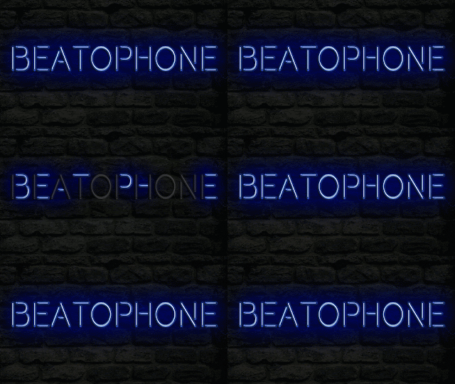
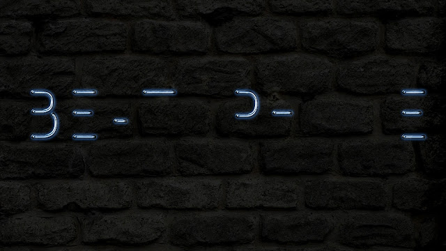
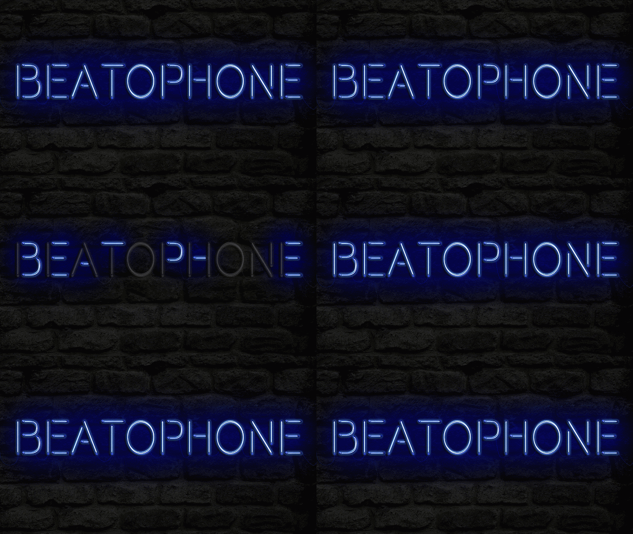
During the lesson Evelyn added in the blinking effect for the neon sign idea that I came up with. She did this by importing the three image files which she had created separately, and she made sure to take the rhythm into consideration when doing this and then adjusted the timings. 


In order to be able to adjust the timing and make the blink quite quick she had to zoom in with the Zoom Tool so that she could look at milli-seconds and this ensured the accuracy and slickness of this ending. 

She decided to make each section of the blink about 2 milliseconds long as she thought that this would give the audience enough time to read the text and also see the unfolding of the effect at the same time. 


After this she then proceeded to add in the Half-Off image, which then allowed her to cut to black without it looking strange and from speaking to Evelyn she says that this looks very effective.

In order to get some feedback on what she had done she also talked to Matt about the possibility of putting a buzzing sound on the top of the visuals to make the ending even more effective and he agreed that this would provide a very strong ending to our music video.

Experimenting with a black and white edit

Due to the fact that much earlier in the year when we were coming up with our initial concepts for our music videos we had discussed using black and white for the 1920's element. We decided to try it out to see how it looks with our final edit.

This means that by doing this we can save time during our sessions in the edit suite. However, when we tried it out we were unsure whether we liked the outcome and whether it looked odd when the colour comes in as we didn't want it to look out of place as well as the fact that we wanted the 1920's and futuristic elements to work well together and not look too juxtaposed against each other. 

I think that the black and white effect will help us to create and reinforce the era that we are trying to depict int he 20's section, but we are unsure as to whether the mad scientist sections should be in colour too. Therefore we are unsure as to whether alternating between gray-scale and vibrant colour is the best idea. 


We asked for feedback from other people who were in the edit suite at the same time and someone suggested that we could add a splash of colour during the black and white so that it doesn't look entirely gray scale, using the "Leave Colour" tool. I thought that this might be an interesting effect to experiment with and it might help us to ensure that the switch from back and white to colour isn't too much and doesn't look out of place. 

Here is a tutorial I found on YouTube about how to achieve this in Premiere Pro:

Creating the Neon Sign


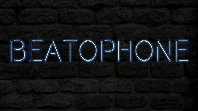
During our editing session on Friday I suggested that we could have some kind of text at the end of the music video, as we are having it fade to black. I suggested that we put a blinking neon sign reading "Beatophone". Due to the fact that we wouldn't be able to actually get that from anywhere, Evelyn decided to go ahead and create one using Photoshop.


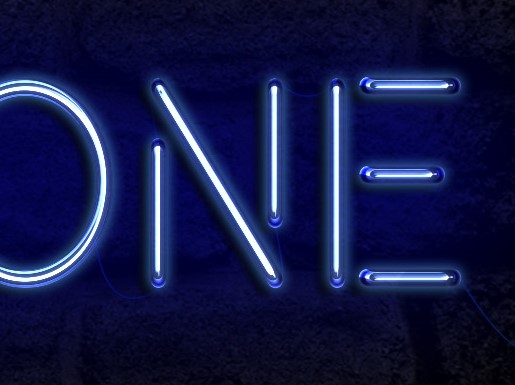
To begin with, she created the text in all caps using the font Beon Medium from 1001 fonts. The colour she used was #89c8f4 and she then had to right-click on the layer and rasterized the type, which means that she transformed it from a vector-based file to a bitmap file. Then, using the Marquee Tool she went ahead and selected the horizontal lines from the font and separated them from the vertical lines, putting them on a different layer. She did this because what she did next was different for the horizontals and verticals. Evelyn the set both fill values to 0, which removed the colour from the text so the effect would spark up more.


She then duplicated the horizontal and verticals twice, as she said that this would create similar effects, however strengthen them on each layer to make the lines look 3D.

To start off, she went to the first horizontal layer and used the Bevel & Emboss with the following settings:
Size: 10
Unchecked the Use Global Light box
Angle: 0
Altitude: 70
Checked the Anti-aliased box
Highlight Mode: Linear Light
Shadow Mode - Opacity: 0%

This allowed her to create the blue base of the letters, on which she would then build up a glow and shine. She also created an Inner Shadow to create the blue hue. The settings she used were:
Blend Mode: Screen
Colour: #7aaef4
Angle: 30
Distance: 0

She also added an Inner Glow with the following settings:
Opacity: 85%
Colour: #7aaef4
Source: Center
Size: 18

And a Drop Shadow with these settings:
Distance: 13
Size: 7


Additionally, she then did similar things for the vertical lines, except for the fact that the following Bevel and Emboss settings changed to:
Angle: 90
Altitude: 74

In addition, she also changed the settings of Inner Glow:
Size: 15


After this she then created a layer underneath the text and called it Background Light, changed it's blend mode to Linear Light and made the colour #264dda. She followed this up by going along with the brush tool and picked a soft and very large tip and then clicked behind the text to create a fuzzy and light look.


After that, Evelyn did one last thing to make the effect complete, which was adding cables combining the separate letters. She did this with the Pen tool and created a path. After she had created the design that we had envisioned, she went ahead and picked the brush tool, changed the settings to:
Brush Size: 2 px
Spacing: 1%
Hardness: 100%

She changed the colour to #3c30ba, picked the Direct Selection Tool, right-clicked the path and chose Stroke Path. This then coloured the path and created the cool wire effect.

She followed this up with blackening out the entire text to make the neon sign to appear off, and then made it so that half the sign was turned on. This allowed us to create the effect of it blinking. 
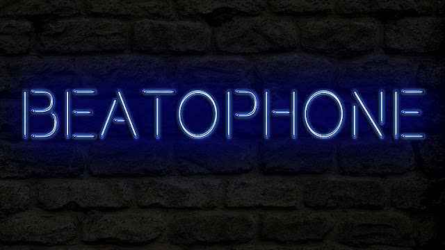
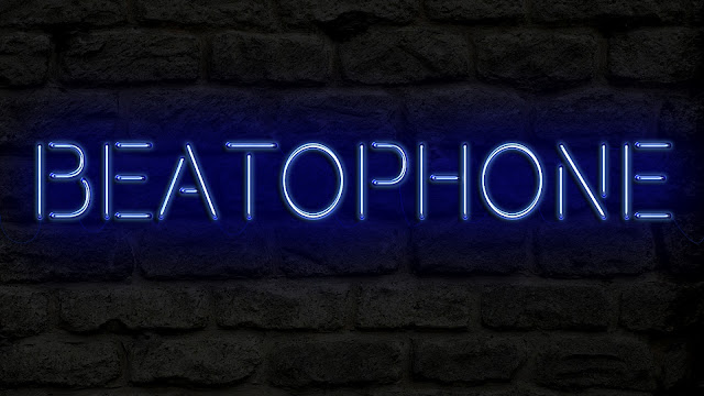
In Version 1 she repeated the on-to-off pattern, and kept it on for a little while, however during our group discussion she revealed the fact that she felt like this didn't look too good. Therefore in Version 2 we decided to switch the pattern to:

On
Half-Off
On
Off
On
Half-Off
Off
On
On
On
On
Off
On

After a group discussion regarding the outcome of this we discovered that version 2 was going to be much more effective for the ending of our music video due to the fact that it created a much more unpredictable pattern. I think that the neon sign effect turned out really well and it looks very effective and funky. I think that the use of the colour blue will work well with the rest of our music video because blue is used within the futuristic section as part of the lighting effect as well as being one of the colours used for the dancers' makeup.I think that this will provide a brilliant ending for our music video and it will look effective after the fade to black transition. 

This is version 1:

This is version 2: